Project Structure
Rules
This section is used to define certain settings to intended modules within the scope of the project from a fixed point.
Basket
| Name | Description | Type | Default Value |
|---|---|---|---|
| basketItem | |||
| swipeToDelete | Indicates the Swipe to Delete process | boolean | true |
| swipeToDeleteOptions | Indicates the settings of the swipeToDelete value iconName: The name of the icon displayed while deleting | boolean | true |
| openModalForDelete | Indicates the opening status of the modal while deleting | boolean | false |
| itemImage | |||
| imageSize | Indicates the image size of the products in cart | object | {width: 400, height: 600} |
| itemPrice | |||
| showTotalPrice | Indicates the visibility of total price for retail products | boolean | true |
| itemRetailPrice | |||
| showTotalPrice | Indicates the visibility of total price for retail products | boolean | true |
Combine
| Name | Description | Type | Default Value / Link |
|---|---|---|---|
| imageViewer | |||
| swiperOptions | Indicates the values available for the swiper component displayed for product images on the combine page | object | Props |
| swiperImageCropSizes | Indicates the size for the images displayed on the swiper | object | {width: 500, height: 500} |
| zoomViewerOptions | Indicates the zoom settings for the images displayed on the swiper | boolean | Props |
| zoomImageCropSizes | Indicates the size of the image zoomed on the swiper | object | {imageWidth: 750, imageHeight: 750} |
Product Detail
| Name | Description | Type | Default Value / Link |
|---|---|---|---|
| gridElements | |||
| content | Indicates the value for the content element in product detail | object | Content |
| imageViewer | |||
| carouselOptions | Indicates the settings for the carousel component | object | Props |
| carouselImageCropSizes | Indicates the size of the image displayed on the carousel component | object | {width: 400, height: 500} |
| zoomViewerOptions | Indicates the zoom settings of the images displayed on the carousel | boolean | Props |
| zoomImageCropSizes | Indicates the size of the image zoomed on the carousel | object | {imageWidth: 750, imageHeight: 750} |
| page | |||
| addToCartAnimation | Indicates the animation type for adding to cart | ‘modal’ , ‘snackbar’ | ‘modal’ |
| modals | |||
| contentDrawer | |||
| modalImage | Indicates the status of the feature “quick add to cart” | object | {width: 35, height: 35} |
| quickAddToCart | |||
| isEnable | Indicates the size of the images on the modal where product variants can be examined | boolean | true |
| validationModal | |||
| isEnable | Indicates the visibility of the validation modal | boolean | false |
| variants | |||
| colors | |||
| buttonImage | Sets the size of color buttons | object | {width: 500, height: 400} |
| modalVariant | |||
| variantImage | Indicates the size of the modal images for product variants | object | {width: 500, height: 500} |
Profile
| Name | Description | Type | Default Value |
|---|---|---|---|
| page | |||
| resendSmsTime | Indicates the time to resend SMS to the user | number | 180 |
Styles
All the styles of the application are imported/exported to the styles/index.js path. The exported style objects are sent to the createApp function as a parameter via the styles key. Style objects must be exported as an object with a prefix starting with $rules_. The prefix of the style objects starting with the $rules_ prefix are split and created with Stylesheet.create. (For instance: $rules_homeStyles is created as homeStyles.) The style path is sent with the className props while using framework elements.
Example
Creating a view on the homepage and defining a style
As shown below, a style object starting with $rules_ must be exported in the styles/homePage/view.js path.
const $rules_customView = {
 viewStyle: {
   flex: 1,
   backgroundColor: "#ccc"
 }
}
export { $rules_customView };
All styles for the homePage in the styles/homePage/index.js path must be imported/exported.
import { $rules_view } from "./view.js";

export { $rules_view }
All styles written for the application in the styles/index.js path must be imported/exported.
import * as homePage from './homePage';

export { homePage }
When creating a style object with this structure, the className props of the View element should be given the “homePage.customView.viewStyle” value.
import { View } from "@elements";

<View className="homePage.customView.viewStyle" />
Static Text Maps
This is used to define the static texts used within the project from a fixed point. This is where static texts are configured based on language. All the static texts of the application are imported/exported to the path staticTextMaps/index.js.
Example
If a static text is to be used on the account page:
The text that is going to be used needs to be defined within staticTextMaps/account.json.
{
 "LOGOUT": { "tr": "Çıkış Yap", "en": "Log Out" },
}
And this definition needs to be exported from the path staticTextMaps/index.js.
import account from './account.json';
export default {
  account,
  ...
};
Then, the file staticTextMaps/index.js needs to be imported within the page to destruct the account object.
import staticTextMaps from '../../staticTextMaps';

const { account: $account } = staticTextMaps;

<Button text={$account.LOGOUT} />
Multiple Language
The languages that are going to be used within the project are defined within staticTextMaps/languageConfig.json.
[
 {
   "name": "Turkish",
   "isDefault": false,
   "isRTL": false,
   "label": "Türkçe",
   "code": "tr",
   "region": "tr",
   "key": "tr"
 },
 {
   "name": "English",
   "isDefault": true,
   "isRTL": false,
   "label": "English",
   "code": "en",
   "region": "en",
   "key": "en"
 }
]
Integration Maps
This is used for the configuration of states that can be customized within the process of fetching data used within the project from the backend. For example, it can be used to determine the field name with which the data will be fetched or the URLs to which the request will be sent. The application’s entire map layer is imported/exported with the path integrationMaps/index.js.
Example
There are a minimum of 2 integrationMap objects that need to be defined while fetching data from the backend. In our exemplary scenario, we can look at the user’s search process.
First, the end point to which the backend will send a request needs to be defined. For this, we can use the object integrationMaps/urls.json.
{
 "SEARCH": "/autocomplete/?search_text=",
 ...
}
Then, the generated data needs to be standardized. For this, we can use the object integrationMaps/search.json.
{
 "GROUPS": "groups",
 "TYPE": "suggestion_type",
 "ENTRIES": "entries",
 "CATEGORY": {
   "ID": "extra.category_id",
   "LABEL": "label",
   "PARENT_CATEGORIES": "extra.parent_categories"
 },
 "PRODUCT": {
   "TYPE": "extra.product_type",
   "LABEL": "label",
   "URL": "url",
   "IMAGE": "extra.image",
   "PRICE": "extra.price",
   "RETAIL_PRICE": "extra.retail_price"
 },
}
Follow this link to fetch data via integrationMap and for stages of modeling.
Theme Configs
This section manages the general style and component config settings within the application. Style definitions can be made on this module when a central standard management is required.
| Name | Description |
|---|---|
| form | |
| PICKER_HEADER | The style structure of picker headers |
| PICKER_ITEM_WRAPPER | The wrapper style structure of the items within pickers |
| CHECKBOX_AND_RADIO_LABEL | The style structure of the labels of CheckBox and radio components |
| VALIDATION_ERROR_TEXT | The style structure of the text of the validation error messages |
| DATE_PICKER_CONTAINER_IOS | The container style structure of the date pickers on the iOS platform |
| PICKER_MODAL | The general container style structure of the picker modal component |
| INPUT | The style structure of input components |
| RADIO_GROUP_TITLE | The title style structure of radio group component |
| PICKER_INPUT | The style structure of the input components of pickers |
| PICKER_ITEM_TEXT | The text style structure of the items within pickers |
| CHECKBOX_AND_RADIO | The general style structure of CheckBox and radio components |
| general | |
| FACEBOOK_BUTTON | The general style structure of the Login with Facebook button |
| BUTTON_ICON | The general style structure of button icons |
| TEXT_LINE_HEIGHT_RATE | The value of text line height |
| CURRENCY_POSITION_RELATIVE_TO_PRICE | The value of currency position |
| BUTTON_ICON_CONTAINER | The container style structure of button icons |
| OUTLINE_BUTTON | The style structure of the outline button |
| DISABLE_BUTTON | The style structure of the disable button |
| CONTAINER | The general style structure of containers |
| BUTTON_CONFIGS | The general config structure of buttons |
| hasIcon | The visibility status of the icon |
| textColor | Text color |
| textAlign | Text alignment |
| CONTENT | The general style structure of content |
| TEXT | The style structure of texts |
| SUCCESS_BOX_BUTTON_CONTAINER | The container style structure of the success button component |
| BUTTON_STYLE | The general style structure of buttons |
| USE_BASE_CURRENCY_SYMBOL | The status of use for base currency value |
| header | |
| SEARCH_BUTTON | Indicates the visibility of the search button in the header component |
| ALIGN_BODY_CONTENT | Indicates the alignment status of the body content |
| navbar | |
| NAVBAR_ITEMS_CONTAINER | The container style structure of the items on the Navbar |
| SEARCH_INPUT | Indicates the input style value of the search bar |
| HEADER_TEXT | The style structure of the text in the header component |
| PROMOTION_TEXT_WRAPPER | The wrapper style structure of the text in the promotion component |
| SEARCH_INPUT_TEXT | Indicates the text style of the input on the search bar |
| BASKET_COUNT_WRAPPER | The wrapper style structure of the section to show the number of products in cart |
| BARCODE_SCANNER | The style structure of the barcode scan component |
| PROMOTION_TEXT | The style structure of the text in the promotion component |
| NAVBAR_CONFIGS | The config style structure of the Navbar |
| logoPositionCenter | The status for the central alignment of the logo |
| searchButtonVisible | The visibility of the search button |
| headerIconColor | The color value of the header icon |
| BASKET_COUNT_TEXT | The text style structure of the section to show the number of products in cart |
| searchComponent | |
| BARCODE_BUTTON_VISIBLE | Indicates the visibility of the barcode scan button in the search component |
| sidebar | |
| WIDTH | Indicates the width of the Sidebar |
| snackBar | |
| SNACKBAR_CONFIGS | The structure for Snackbar’s config settings |
| successBgColor | The background color for Success status |
| successTextColor | The text color for Success status |
| spinner | |
| HAS_ICON_SPINNER | Indicates the status of the icon in the spinner component |
| ICON_SPINNER_SIZE | Indicates the size of the spinner |
| textStatuses | |
| secondary | The structure for the secondary font object information |
| bold | The structure for the bold style font object information |
| touchableOpacity | |
| ACTIVE_OPACITY | The active opacity of the TouchableOpacity component |
Data Containers
Introduction
This layer carries out the state management, api call, and api response mapping processes for the application. For state management, Redux is used with thunk middleware. The data containers exported in the dataContainers/index.js path are sent to the createApp function as a parameter with the dataContainers key. The Redux store is created with the dataContainers sent with the createApp function parameter.
Concept Definitions
Actions
Redux actions are defined. A new class is created in the base action class and exported. Click for the base actions list.
Example
import { BasketActions } from '_dataContainers/baseContainers/basket';

class Action extends BasketActions {}

export default Action;
Constants
Redux action types are defined. A new instance is created in the base action class and exported. Click for the base constants list.
Example
import { BasketConstants } from '_dataContainers/baseContainers/basket';

class Constants extends BasketConstants {}

export default new Constants();
Model - Mappers
API responses are mapped based on integration maps configs. Base model is imported, and a new class is created with base maps and exported. Click for the base models list.
Example
import { BasketModel } from '_dataContainers/baseContainers/basket';

const { BasketMappers } = BasketModel;

class Basket extends BasketMappers {}

export default Basket;
Model Binders
The action types in the redux are mapped with the functions in model-mappers, and the action’s payload is sent to the mapper function as a parameter. A new instance is created in the base model binders class and exported. Click for the base model binders list.
Example
import { BasketModelBinders } from '_dataContainers/baseContainers/basket';

class ModelBinders extends BasketModelBinders {}

export default new ModelBinders();
Reducer
Redux reducers are defined.
A new instance is created in the base reducer class. The new instance is exported from the framework with the convertReducer utils.
Click for the base reducers list.
Example
import { BasketReducer } from '_dataContainers/baseContainers/basket';
import { convertReducer } from '_utils/dataContainer';

class Reducer extends BasketReducer {}

export default convertReducer(new Reducer());
Create New Container
Below can be seen the example in which data containers are created for the search feature.
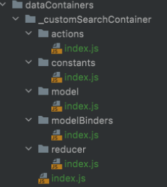
The folder structure below is created in the dataContainers path for the custom container.
constants/index.js Redux action types are exported.
actions/index.js Redux actions are defined for the API call.
modelBinders/index.js Redux action types are mapped with the model mapper functions. If the defined action type is dispatched, the action payload is sent to the function as a parameter.
import constants from '../constants';

const { FETCH_SEARCH_FULFILLED_CUSTOM } = constants;

class ModelBinders {
 defaultBinders = {
   [FETCH_SEARCH_FULFILLED_CUSTOM]: 'searchMapper',
 };
}

export default new ModelBinders();
model/index.js The class instance or object including the functions defined in modal binders must be exported. The data retrieved from the action payload is sent to the function as a parameter. The API response is standardized with integration maps configs, and modeled data is sent to reducer with the data key.
reducer/index.js A class is created for the redux reducer, and this class must have a function named handleAction. Modeled action is sent to the handleAction function as a parameter. The created class instance is exported with the convertReducer function.
index.js The data container must be instantiated from BaseContainer class with the keys seen below and exported.
import BaseContainer from '@core/dataContainers/baseContainer';

import actions from './actions';
import model from './model';
import reducer from './reducer';
import constants from './constants';
import modelBinders from './modelBinders';

const basketContainer = new BaseContainer({
 reducer,
 model,
 actions,
 constants,
 modelBinders,
})

export default basketContainer;
Extend Framework Container
Base containers may not always fulfill requirements, and they can be expanded based on needs.
Exemplary Scenario:
The order cancel action within the application does not fulfill the needs of the customer. Order ID should be sent at the end of the URL instead of within the request body.
It’s possible to make the necessary changes to meet the customer’s needs by overriding the postCancelForm function in the OrderActions class.
// dataContainers/orders/actions/index.js

import { OrdersActions } from '_dataContainers/baseContainers/orders';
import { platformConfigs } from '_dependencies';
import { request } from '_core/request';
import { textGenerator } from '_utils/string';

const {
 integrationMaps: { urls: $urls },
} = platformConfigs;

class Action extends OrdersActions {
 postCancelForm = (orderItems, orderNumber, orderId) => (dispatch) => {
   dispatch(this.pending());
   request({
     method: 'post',
     url: textGenerator($urls.CANCELLATION_REQUEST, { orderNumber }),
     data: {
       cancel_order_items: orderItems.map((item) => ({
         order_item: item.id,
         reason: item.reason.id,
         cancellation_type: item.reason.type,
         description: item.reason.label || '',
       })),
     },
     headers: {
       'x-requested-with': 'XMLHttpRequest',
       'referer': `${$urls.BASE_URL}${$urls.ORDERS}`,
     },
   })
     .then(() => {
       dispatch(this.fetchOrderDetail(orderId));
       dispatch(this.orderItemCancellationRequest(orderItems));
     })
     .catch((error) => {
       dispatch(this.cancelRejected({ apiError: error }));
     });
 };
}
export default Action;
Here’s how to update the constants class created to add a new constant:
/ dataContainers/search/constants/index.js

import { SearchConstants } from '_dataContainers/baseContainers/search';

class Constants extends SearchConstants {
 constructor() {
   super();
   this.NEW_CONSTANT = 'NEW_CONSTANT'
 }
}
export default new Constants();
Pages
Homepage
Homepage is a blank page where you can add widgets. Widgets are selected and managed on the Omnitron administration panel.
Selected widgets are fetched from the backend with the help of pageContainer structure, which is located within the mobile application and controlled automatically, and added to the homepage under the name of “widget” under props.
How to Use Widgets
Widgets that are transmitted to the homepage under props are transformed into components that will be visible on the screen with the help of the renderWidget function.
const renderWidget = (
 { widget_type: type, widget_slug: slug, widget_id: categoryId },
 index,
 scrollViewRef,
) => (
 <HomeWidget
   type={type}
   navigation={navigation}
   slug={slug}
   categoryId={categoryId}
   key={`widget_${index}`}
   scrollViewRef={scrollViewRef}
 />
 );
Then, these components are turned into scenes with the help of the renderScenes function so that they are a part of a stack structure. In the render method of the page, you can render and use widgets with the help of the renderScenes() function. Based on requests, custom components can also be used on the page.
What is Scene
Scene is the structure used to make vertical or horizontal alignments between these components when more than one component is asked to be displayed in React Native.
The renderScenes function helps us with this.
const renderScenes = () => {
 return scenes.map((scene, i) => (
   <Content className="homePage.gridElements.content" tabLabel={scene} key={i}>
     {widgets[scene].map((widget, j) => renderWidget(widget, j, refs[i]))}
   </Content>
 ));
};
Omnitron Widget Management
You can find a detailed description of the management of widgets on the Omnitron administration panel in this link.
Creating Widgets
Please see the Custom Widget Manual below to create widgets rendered on the homepage. In order to create a widget, the code must be developed first. A new addition will be made such as the default widgets defined on the boilerplate application. After development, a schema will be defined to create Widget Type and Widget Content via Omnitron.
Creating Container Widget
Container widgets are the widgets that specify the ones to be rendered on the homepage. This widget is created once, and its content is updated with the addition of new widgets. Please follow the steps explained in Widget Type and Widget Content to create a container widget. When creating the Widget Type, a schema must be created similar to the json file below:
{
  "element": {
    "multi": true,
    "schema": {
      "widget_type": {
        "data_type": "text",
        "key": "widget_type",
        "label": "Widget Types"
      },
      "widget_id": {
        "data_type": "text",
        "key": "widget_id",
        "label": "Widget ID"
      },
      "widget_slug": {
        "data_type": "text",
        "key": "widget_slug",
        "label": "Widget Slug"
      }
    },
    "data_type": "nested",
    "key": "element",
    "label": "Mobile Widgets"
  }
}
! This created container Widget Content must have the same value in the slug field as the value of the “WIDGETS” field under platformConfigs/urls.json.
Custom Widget Manual
In the boilerplate application, the default widgets are located within the widgets folder in the folder that contains the HomePage page. This folder contains widgets such as story, categorylist, etc. Below you can find an example in which a folder named customWidget is created for a widget named customWidget, and the index.js is added to this folder.
The code base of the created index.js file must be similar to the one below:
…
import { useWidgetFetch } from '_hooks';
import { BaseWidgetModel } from '../_baseWidgetModel';
…
const CustomWidget = ({ slug }) => {
 const { data, loading, error } = useWidgetFetch(slug);
 const [customWidgetData, setCustomWidgetData] = useState([]);
 ...
 const getCustomData = (fetchResult) => {
   const customDatas = fetchResult.data.attributes.customData;
   const mappedCustomData = customData.map((customData) => new BaseWidgetModel(customData));
   setCustomWidgetData(mappedCustomData);
 };
…
 useEffect(() => {
   if (data) getCustomData(data);
 }, [data]);

 if (loading) return <Spinner styleName="centerPadding" />;

 if (error || !customWidgetData?.length) return null;

 return (
   <View className="homePage.widgets.customView.wrapper">
     {customWidgetData.map(data => (
             …
       ))}
     …
   </View>
 );
};
CustomWidget.propTypes = {
 slug: PropTypes.string.isRequired,
};
export default CustomWidget;
Slug
This is the URL extension of the widget created on the Omnitron - Widget Management panel. As an example, let’s have the base URL of demo.akinon.net. In order to fetch to this URL the widgets defined when the homePage is rendered, a request is sent with demo.akinon.net/widgets(WIDGET_BASE)/mobile-widgets(SLUG) and receive access to the widgets rendered on the page. These widgets can be called the container of the widgets created. Similarly, when the request demo.akinon.net/widgets/custom-widget(slug) is sent for a widget with a defined type, the returning result is based on the schema defined via Omnitron.
Fetching
As in the example given above, pass the slug parameter with the useWidgetFetch hook to fetch the widget data.
Data Mapping - Widget Modeling
As in the example given above, the fetched widget data is constructed in the getCustomData function with the BaseWidgetModel class in order to be used to work from a single base. If a custom model is to be added, it can be defined and used in the widgets/_baseWidgetModel folder. Example: _baseWidgetModel/homeRecommendationProduct.js
Import to Render
The customWidgets is imported to the widgets/index.js folder in order to render the created widget named customWidget, and is added, as shown below, to the widgets object. Thus the renderScenes function on the HomePage page maps based on the defined widgets key (custom_widget (slug)) and renders the widget.
import { React } from '_dependencies';
import CustomWidget from './customWidget;

const widgets = {
…
 custom_widget: CustomWidget,
…
};

const HomeWidget = ({ type, ...restProps }) => {
 if (type in widgets) {
   const Component = widgets[type];
   return <Component {...restProps} />;
 } return <></>;
};

export default HomeWidget;
Passing Custom Props
The HomeWidget component rendered on the HomePage passes the props below. Follow the steps below if an additional x prop needs to be passed to the widgets.
<HomeWidget
     type={type}
     navigation={navigation}
     slug={slug}
     categoryId={categoryId}
     key={`widget_${index}`}
     scrollViewRef={scrollViewRef}
     containerHeight={containerHeight}
…
     x={`customPropValue`}
   />
Creating Widget Type (Omnitron)
After adding a new widget type, the added widget type needs to be also added to the container widget. Otherwise, the application wouldn’t be able to tell which widgets should be rendered on the page. Since schema is specified with the finalization of development, a schema can be defined to the customWidget by following the steps below via Omnitron.
- Log into Omnitron
- Click Content Management under Sales Channels in the left menu
- Click Widget Schema Management on the new page
- Click the + Add Widget Schema button on the top right corner of the page to open the page to add schema/type
- Enter Widget Type (e.g. Custom Widget Type)
- Enter Schema (e.g. json data)
- Click the Save button to create a Widget Schema
Creating Widget Content (Omnitron)
After creating Widget Type, the next step is to create Widget Content based on the created schema (unless it’s Recommendation widgets. This page enables creating dynamic content based on the created schema. Follow the steps below to create the customWidget data:
- Log into Omnitron
- Click Content Management under Sales Channels in the left menu
- Click Widget Management on the new page
- Click the + Add New Widget button on the top right corner of the page to open the page to add widget content
- Enter Widget Name (e.g. Custom Widget Content)
- Enter Widget Slug (e.g. custom_widget)
- Enter Widget Type (e.g. Custom Widget Type)
- Enter Template (e.g. /)
- A button appears in the bottom left section of the form to add dynamic content to the schema of the selected type (e.g. + Custom Content). Click this button to fetch another form based on the created schema and to create unlimited content.
Recommendation - Collection Widgets
In this example, the Widget Content is selected from among collections. First, a Widget Type needs to be created. Enter Type, and leave Schema empty (since the collection schema is used). Follow the steps below to map widget type with product collection:
- Log into Omnitron
- Click Content Management under Sales Channels in the left menu
- Click Recommendation System on the new page
- Click the + Add New Collection Widget button on the top right corner of the page
- A form appears on the new page
- Enter Widget Name
- Select Widget Type (the one created without a schema)
- Enter Template (e.g. /)
- Select Collection (e.g. x collection)
- Enter Collection Limit (e.g. 24)
- Collections can be added/edited in the Collections page under Products and Catalogs in the left menu.
- Click the Save button
Widget List
The data of each widget is fetched during rendering. This fetching is carried out by the useWidgetFetch hook.
Story
It’s the component that lists widgets in the type of story.
Recommendation
It’s the component that lists widgets in the type of home_recommendation.
Category List
It’s the component that lists widgets in the type of category_list.
Swiper
It’s the component that lists widgets in the type of home_swiper.
Category Banners
It’s the component that lists widgets in the type of image_link_category_banner.
Product Detail Page
This is the product detail page. It’s where you can find detailed information about the product, add it to favorites, select variant and quantity, and add it to the cart.
You can follow the steps in this link if you don’t know how to create a Product in Omnitron.
Based on requests, custom components can also be used on the page.
The entire page is managed with detail page container. The productDetail and basket data containers are sent to the page container via parameter.
ProductDetail(productDetailGrid, pageOptions, {
 productDetail: dataContainers.productDetail,
 basket: dataContainers.basket,
});
How to Use Page Context
The available parameters received via page container
Actions
| Name | Task | Parameter |
|---|---|---|
| addToCart | Used when you wish to add the product to the cart | |
| addToFavouriteHandler | Used to add the product to favorites | pk, product |
| removeFromFavouriteHandler | Used to remove the product from favorites | favouritePk, product |
| handleChangeVariant | Used to select variant | searchKey, variant, status |
| handleFavouriteError | Used to turn off favorite modal | |
| hideProductAddedModalHandler | Used to turn off added to cart modal | |
| setQuantity | Used to update product quantity | quantity |
| validationReset | Used to reset the errors created while adding to cart |
Data
| Name | Task | Type |
|---|---|---|
| state | The react state of the page | object |
| props | The data coming from store and modal | object |
Info & Favorites
This is the section where you can display the images, name, brand, and stock availability of the product and update favorite status.
<CarouselImageViewer
  images={props.product.images}
  carouselOptions={imageViewer.carouselOptions}
  carouselImageCropSizes={imageViewer.carouselImageCropSizes}
  zoomViewerOptions={imageViewer.zoomViewerOptions}
  zoomImageCropSizes={imageViewer.zoomImageCropSizes}
  pagination
/>
<FavouriteButton
  favourite={props.favourite}
  product={props.product}
  removeFromFavouriteHandler={removeFromFavouriteHandler}
  addToFavouriteHandler={addToFavouriteHandler}
  navigation={props.navigation}
  isLogin={props.isLogin}
  pending={props.pending}
  favouritePending={props.favouritePending}
/>
<ProductTitle product={props.product} />
<ProductBrand product={props.product} />
<NoStockInfo product={props.product} />
Variants & Quantity
This is the section where you can select color, size, and quantity for the product. If the user doesn’t make mandatory selections, the ModalVariant component is created within Variants.
<Variants
  colorVariantOptions={variants.colors}
  modalVariantOptions={variants.modalVariant}
  modalVariantDrawerOptions={modals.contentDrawer}
  variants={props.product.variants}
  status="productDetail"
  navigation={props.navigation}
  product={props.product}
  onSelect={handleChangeVariant}
/>
<QuantityButtons
  quantity={state.quantity}
  product={props.product}
  onPress={(count) => setQuantity(count)}
/>
Price & Add To Basket
This is the section where the product can be added to cart along with price and discount information. If the user successfully adds a product to cart, the AddedToCartModal is displayed.
import { ProductPrice } from '_components/productDetail/productPrice';
import { ProductRetailPrice } from '_components/productDetail/productRetailPrice';
import { ProductDiscountPercentage } from './views/productDiscountPercentage';
import { AddToCartButton } from './views/addToCartButton';
import { AddedToCartModal } from '_components/productDetail/modals/addedToCartModal/modal';

<ProductRetailPrice product={props.product} />
<ProductPrice product={props.product} />
<AddToCartButton
  pending={props.basketPending}
  product={props.product}
  onPress={addToCart}
/>
<AddedToCartModal
  visible={props.productAddedModalBasket}
  hideModal={hideProductAddedModalHandler}
>
  ...
</AddedToCartModal>
Basket Page
Basket page comprises the features below:
- Displaying the products added to cart,
- Updating product quantity,
- Removing from cart,
- Removing the product from cart by swiping (swipeToDelete),
- Displaying discounts and total price information,
- Confirming the cart and checkout.
- Displaying the “Cart is Empty” warning if no product is added to cart
Basket page is managed with basketContainer. As you can see below, the basket and checkout dataContainers are sent from the Basket Page as parameters. Thus basketContainer can manage the functions, actions, and states to be used on the UI, making a differentiation between UI and logic.
export default Basket(basketGrid, {
 basket: dataContainers.basket,
 checkout: dataContainers.checkout,
});
Page Context
The props information received via page container
| Name | Task | Parameter |
|---|---|---|
| navigation | Used to manage react navigation. | |
| route | Includes the information related to the page’s navigation route | |
| handleDiscount | Used to apply discounts and vouchers | couponCode, discountRemove |
| handleSubmitGiftNote | Used to submit a product-based gift note | pk, giftNote |
| handleRemoveGiftNote | Used to remove a product-based gift note | pk |
| handleChangeQuantity | Used when the number of products in cart changes | pk, quantity, basketItem |
| handleAddToFavourite | Used when the product removal modal is opened and the product is added to favorites | pk, product |
| confirmBasket | Used when the cart is confirmed | |
| hasFavourite | The HAS_FAVOURITE field value under platformConfigs/app.json | |
| basket | Includes the fields related to the cart, which are listed below | |
| basket.amounts | Includes the price information of the products in the cart. The contents are explained below. | |
| basket.amounts.getTotalAmount() | Presents the total amount by applying discount and campaign calculations | |
| basket.amounts.getTotalDiscountAmount() | Total discount amount | |
| basket.amounts.getTotalProductAmount() | Total product amount | |
| basket.amounts.getCampaignTotalAmount() | Total campaign amount | |
| basket.products | Products added to cart | |
| basket.upsell | Campaign messages | |
| basket.voucherCode | Voucher code applied to cart | |
| basket.discounts | Discounts applied to cart | |
| basket.totalQuantity | Total product quantity added to cart | |
| basket.quantity | Product quantity added to cart | |
| basket.totalDiscountAmount | Total discount amount applied to cart | |
| pending | This returns true when any network request is made, and the Spinner is loaded in this state. If it returns false, the page has been loaded. | |
| validation | This checks validity when a coupon or a voucher is applied to the cart and submitted. | |
| apiError | If an error occurs as a result of any network request, an error message returns to this object. | |
| Example: apiError.nonFieldErrors | ||
| initialSuccess | This field returns true when the cart is fulfilled (loaded without error). | |
| favourites | This returns to the products added to favorites. A “move to favorites” actionSheet is opened if the product that is requested to be removed has not been added to favorites. | |
| isLogin | The information whether the user has logged in |
Components
CampaignSwiper
This component displays campaigns that are exclusive to the cart. The upsell series within the basket object fetched from pageContainer includes campaign messages. This component enables the rendering of messages on the basket page as shown below.
BasketItem
This component renders the products in the products series returning from the basket object. This component renders the sections where you can update quantity, remove, remove by swiping, warn with modal when removed, and display information about the product. This component renders certain components we can describe as children, and distributes the props transmitted to the components to subcomponents. Subcomponents are explained below.
- If the swipeToDelete feature is to be used, the swipeToDelete flag in the path below should be switched to true.
- openModalForDelete: If a modal is to be opened as a warning when swipeToDelete is triggered, the openModalForDelete flag should similarly be switched to true. src/rules/basket/basketItem.js
ItemImage
This component renders the image of the product. The product image path (product.image) is accessed via the props from the BasketItem component and rendered. If the image is clicked, the user is guided to product detail. Since image size may vary, it can be changed from the object in the path below.
src/rules/basket/itemImage.js
ItemName
This component renders the name of the product. The product name path (product.name) is accessed via the props from the BasketItem component and rendered. Similarly, if the name is clicked, the user is guided to product detail.
ItemVariants
This component renders the characteristics of the product (size, color, etc.). The product variants path (product.variants) is accessed via the props from the BasketItem component and rendered. It’s rendered in the form of key and value. Color: Black Size: M
ItemRetailPrice
This component renders the retail sales price of the product. The retail sales price of the product path (product.retailPrice) is accessed via the props from the BasketItem component and rendered. The options object added to the component checks whether the total retail price will be displayed and rendered accordingly. You can switch the showTotalPrice flag in the path below.
src/rules/basket/itemRetailPrice.js
ItemPrice
This component renders the sales price of the product. The price of the product path (product.price) is accessed via the props from the BasketItem component and rendered. The options object added to the component checks whether the total price will be displayed and rendered accordingly. You can switch the showTotalPrice flag in the path below.
src/rules/basket/itemPrice.js
ItemQuantitySelector
This component displays and updates product quantity. The stock information of the product path is accessed via the props from the BasketItem component and rendered. If product stock is larger than 1, a selection modal is opened (actionSheet), and, if not, it’s displayed as “disabled.” If the number of stock is larger than 15, an option is offered to select up to 15, and, if not, to select the number of stock.
<ItemQuantitySelector />
ItemRemoveButton
This component renders the button used to remove the product from the cart.
<ItemRemoveButton />
SummaryTotalCount
<SummaryTotalCount totalQuantity={products.length} />
SubTotalPrice
This component renders the total price amount (including discounts, campaigns, etc.) for products.
<SubTotalPrice amounts={basket.amounts} quantity={products.length} />
Discounts
This component renders the discounts applied to cart.
DiscountOrGiftVoucher
This component renders the form with which discounts or vouchers are submitted. If the discount or the voucher is valid, a discount is applied to the total price.
<DiscountOrGiftVoucher
  voucherCode={basket.voucherCode}
  validation={validation}
  apiError={apiError}
  handleDiscount={handleDiscount}
/>
TotalPrice
This component renders the total price of the products in the cart as well as the discounts and campaigns applied.
<TotalPrice amounts={basket.amounts} />
EmptyBasketView
This component renders a button with the text “Cart is Empty” and “Shop by Category” subtitle in order to inform the user if there are no products in the cart and the cart page is opened.
<EmptyBasketView />
CheckoutButton
This component renders the button used to confirm the cart and proceed to checkout. The login page is called if the user hasn’t logged in.
Profile Page
Profile page comprises the features below;
- Displaying the user information below
- Updating this information
- Using two-factor authentication when updating the form with an SMS code
User Information
- First Name
- Last Name
- Phone
- Date of birth
- Sex
Profile page is managed with a page container. As shown below, the profile data container is sent from the Profile page as a parameter. Thus, the profile page container can manage the functions, actions, and states to be used on the UI, making a differentiation between UI and logic.
import dataContainers from '../../dataContainers';
..
const dataContainer = { profile: dataContainers.profile };
..
export default Profile(
..
 dataContainer,
);
Page Context
The props information received via page container
| Name | Task | Parameter |
|---|---|---|
| props | The object that includes certain features that will be used on the page | |
| props.validation | The object that includes the limitations of the fields within the profile form (first and last name, etc.) | |
| props.apiError | If an error occurs as a result of any network request, an error message returns to this object. Example: apiError.first_name | |
| props.pending | This returns true when any network request is made, and the Spinner is loaded in this state. If it returns false, the page has been loaded. | |
| props.isSuccess | This state switches to true when the profile page form is updated, and an informative message is displayed for success. | |
| props.navigation | Used for react navigation management | |
| props.smsVerificationModal | If this field is true, an SMS verification modal is opened, and the form is verified with an SMS code. | |
| props.route | Includes the information about the navigation route of the page | |
| handleOnChange | Since forms have a dynamic structure, not each field is given a state. Instead, form fields are accessed via the form state. This function enables the updating of the form state when the fields in the form (SMS code, etc.) are updated. | key (example: ‘first_name’), value |
| handleOnSmsFormChange | Since forms have a dynamic structure, not each field is given a state. Instead, form fields are accessed via the form state. This function enables the updating of the form state when the fields in the form (SMS code, etc.) are updated. | key (example: ‘code’), value |
| getFormValue | Used to get the value of any field in the form | key (example: ‘first_name’) |
| hideSmsModal | The function called to close the SMS verification modal | |
| hasResendSms | This flag is checked if resending SMS is requested on the SMS verification modal.HAS_RESEND_SMS under platformConfigs/app.json | |
| resendSms | The function called to resend SMS via the SMS verification modal | |
| handleSubmit | The function that enables the posting of the form by running the necessary validations upon clicking the Save button on the profile form | |
| handleSubmitSmsForm | The function that enables the posting of the form by running the necessary validations upon entering the SMS code in the SMS verification form and clicking the Verify button | |
| getOptions | The function used to get the options in multiple-choice fields in the profile form | key (i.e.; ‘gender’) |
| state | The object that includes the properties of the profile page | |
| state.seconds | Show how many seconds remain for verification when the timer on the SMS verification modal starts running | |
| state.form | The object that includes the form fields on the profile page | |
| state.smsForm | The object that includes the form fields on the SMS verification form | |
| state.countDownStarted | The flag which indicates whether the timer has started after the opening of the SMS verification form |
ChangeEmail Page
This page is used to update the email addresses of users who have logged in.
There are three form fields on the page. These are:
- New Email
- Reenter New Email
- Password
After the completion and submitting of the form, the validity of the fields are checked via validations. If no errors are found, the form is posted. Finally, if it’s successful (isSuccess), the form on the page is hidden and replaced with a success message.
ChangeEmail page is managed with a page container. As shown below, its data container is sent from the ChangeEmail page as a parameter. Thus, the change email page can manage the functions, actions, and states to be used on the UI, making a differentiation between UI and logic.
import dataContainers from '../../dataContainers';
..
const dataContainer = {
 email: dataContainers.email,
 profile: dataContainers.profile,
};

..
export default ChangeEmail(
..
 dataContainer,
);
Page Context
The props information received via page container.
| Name | Task | Parameter |
|---|---|---|
| props | The object that includes certain features that will be used on the page | |
| props.email | The reducer object on the change email page | |
| props.email.isSuccess | This state switches to true when the form on the page is submitted, and an informative message is displayed for success. | |
| props.pending | This returns true when any network request is made, and the Spinner is loaded in this state. If it returns false, the page has been loaded. | |
| props.navigation | Used for react navigation management | |
| props.validation | The object that includes the limitations of the fields within the form on the page (email, password, etc.) Example: It’s checked whether the input entered for validation.email is an email address. | |
| props.apiError | If an error occurs as a result of any network request, an error message returns to this object. Example: apiError.email | |
| props.currentEmail | The user’s current email address returns. | |
| props.route | Includes the information about the navigation route of the page | |
| handleOnChange | Since forms have a dynamic structure, not each field is given a state. Instead, form fields are accessed via the form state. This function enables the updating of the form state when the fields in the form (email, password, etc.) are updated. | key (example: email), value |
| sendForm | The function that enables the posting of the form by running the necessary validations upon clicking the Save button of the form on the page | |
| state.form | The object that includes the information filled in the form (email, repeat_email, password) |
ChangePassword Page
This page is used to update the passwords of users who have logged in.
There are two form fields on the page. These are:
- Old Password
- New Password
- Reenter New Password
After the completion and submitting of the form, the validity of the fields are checked via validations. If no errors are found, the form is posted. Finally, if it’s successful (isSuccess), the form on the page is hidden and replaced with a success message.
ChangePassword page is managed with a page container. As shown below, its data container is sent from the ChangePassword page as a parameter. Thus, the change password page can manage the functions, actions, and states to be used on the UI, making a differentiation between UI and logic.
import dataContainers from '../../dataContainers';
..
const dataContainer = { password: dataContainers.password };
..
export default ChangePassword(
..
 dataContainer,
);
Page Context
| Name | Task | Parameter |
|---|---|---|
| props | The object that includes certain features that will be used on the page | |
| props.password | The reducer object on the change password page | |
| props.password.isSuccess | This state switches to true when the form on the page is submitted, and an informative message is displayed for success. | |
| props.pending | This returns true when any network request is made, and the Spinner is loaded in this state. If it returns false, the page has been loaded. | |
| props.navigation | Used for react navigation management | |
| props.validation | The object that includes the limitations of the fields within the form on the page (old password, new password, etc.) Example: It’s checked whether the input entered for validation.password matches the old password. | |
| props.apiError | If an error occurs as a result of any network request, an error message returns to this object. Example: apiError.password | |
| props.route | Includes the information about the navigation route of the page | |
| handleOnChange | Since forms have a dynamic structure, not each field is given a state. Instead, form fields are accessed via the form state. This function enables the updating of the form state when the fields in the form (old password, new password etc.) are updated. | key (example: ‘password’), value |
| sendForm | The function that enables the posting of the form by running the necessary validations upon clicking the Save button of the form on the page |
Notifications Page
This page is used to update the notification settings of users who have logged in.
There is a form on the page with two radio buttons. These radio buttons are:
- SMS
The notifications page updates the information whether the user will be notified and, if so, through which channels. These channels are via email and SMS. Users who do not wish to receive notifications can switch these radio buttons to passive. Otherwise, the notifications are included in the channels.
Notifications page is managed with a page container. As shown below, its data container is sent from the Notifications page as a parameter. Thus, the notifications page container can manage the functions, actions, and states to be used on the UI, making a differentiation between UI and logic.
import dataContainers from '../../dataContainers';
..
const dataContainer = { notifications: dataContainers.notifications };
..
export default Notifications(
..
 dataContainer,
);
Page Context
The props information received via page container
| Name | Task | Parameter |
|---|---|---|
| navigation | Used for react navigation management | |
| route | Includes the information about the navigation route of the page | |
| handleSubmit | The function that enables the posting of the form by running the necessary validations upon clicking the Save button of the form on the page | |
| pending | This returns true when any network request is made, and the Spinner is loaded in this state. If it returns false, the page has been loaded. | |
| setEmailChecked | The function used to update the active status of notification via email thanks to the switch radio button on the form | |
| setSmsChecked | The function used to update the active status of notification via SMS thanks to the switch radio button on the form | |
| emailChecked | The boolean variable that indicates whether email notifications are active | |
| smsChecked | The boolean variable that indicates whether SMS notifications are active |
Vouchers Page
This page is used to display the vouchers of users who have logged in, in the states specified below.
States
- Active Vouchers
- Future
- Used
- Expired
Vouchers page is managed with a page container. As shown below, its data container is sent from the Voucher page as a parameter. Thus, the voucher page container can manage the functions, actions, and states to be used on the UI, making a differentiation between UI and logic.
import dataContainers from '../../dataContainers';
..
const dataContainer = { coupons: dataContainers.coupons };
..
export default Coupons(
..
 dataContainer,
);
Page Context
The props information received via page container
| Name | Task | Parameter |
|---|---|---|
| navigation | Used for react navigation management | |
| route | Includes the information about the navigation route of the page | |
| pending | This returns true when any network request is made, and the Spinner is loaded in this state. If it returns false, the page has been loaded. | |
| basketOffers | The array that includes vouchers with active status | |
| discountOffers | The array that includes vouchers with used status | |
| expiredOffers | The array that includes vouchers with expired status | |
| futureOffers | The array that includes vouchers with future status | |
Components
CouponCard
This component is used to render the vouchers received via pageContainer.
<CouponCard
           title={$T.BASKET_COUPONS}
           headers={[$T.COUPON_CODE, $T.COUPON_CREATED, $T.COUPON_AMOUNT]}
           offerData={discountOffers}
           selector="orderNumber"
           emptyMessage={$T.EMPTY_BASKET_COUPONS}
         />
| Name | Task | Type |
|---|---|---|
| title | The status title of the voucher | object |
| headers | This indicates the equivalent of each data (key) while rendering voucher data and is defined via platformConfigs/coupons.json. | array |
| offerData | Vouchers | array |
| selector | While rendering vouchers, the “expireDate” is by default rendered next to the voucher date. If this data is to be overridden with another field, that key needs to be written in this props. The example above uses “orderNumber”. | string |
| emptyMessage | If no vouchers can be found in an X situation defined for the user, this props is given a message such as “No Voucher Found”. | object |
Contact Page
This page enables the user to communicate by filling out a contact form.
There are five form fields on the page. These are:
- First and Last Name
- Phone
- Subject
- Message
The areas except for the subject are reserved for text input. The subject is selected with the help of a picker. Here are a few examples for subjects.
Exemplary Subjects
- Complaint
- Suggestion
- Order
- Product
- Online Store
After the form is filled out and submitted, the validity of the fields are checked via validations. If all works well and is finalized (isSuccess), the form on the page is hidden, and an informative message is displayed for success.
Contact page is managed with a page container. As shown below, its data container is sent from the Contact page as a parameter. Thus, the contact page container can manage the functions, actions, and states to be used on the UI, making a differentiation between UI and logic.
import dataContainers from '../../dataContainers';
..
const dataContainer = {
 contact: dataContainers.contact,
 orders: dataContainers.orders,
};
..
export default Contact(
..
 dataContainer,
);
Page Context
| Name | Task | Parameter |
|---|---|---|
| props | The object that includes certain features that will be used on the page | |
| props.pending | This returns true when any network request is made, and the Spinner is loaded in this state. If it returns false, the page has been loaded. | |
| props.isSuccess | This state switches to true when the form on the page is submitted, and an informative message is displayed for success. | |
| props.navigation | Used for react navigation management | |
| props.route | Includes the information about the navigation route of the page | |
| props.validation | The object that includes the limitations of the fields within the form on the page (first and last name, email, etc.) Example: It’s checked whether the input entered for validation.email is an email address. | |
| props.apiError | If an error occurs as a result of any network request, an error message returns to this object. Example: apiError.email | |
| hasLocalError | This field switches to true if any error occurs while fetching the orders during picker selection on the form. | |
| getFormValue | This function is used to access the value of any field from form fields. | key (example: ‘full_name’) |
| handleOnChange | Since forms have a dynamic structure, not each field is given a state. Instead, form fields are accessed via the form state. This function enables the updating of the form state when the fields in the form (first and last name, email etc.) are updated. | key (example: ‘full_name’), value |
| handleFormSubmit | The function that enables the posting of the form by running the necessary validations upon clicking the Save button of the form on the page | |
| errors | This object receives error messages in case of any error on the form on the page, and it’s displayed below the Submit button at the bottom of the form. | |
| getPickerData | Used to retrieve the data of the pickers on the form | key (example: ‘subjects’ |
| state | The object that includes the data within the page | |
| state.localNonFieldErrors | This field receives a validation message if the orders are selected via the picker, and the user hasn’t logged in. | |
| state.form | This is the form object within the page and includes form fields. |
GuestLogin Page
This page is displayed when the user wishes to proceed to checkout without login. After login, the user is directly taken to checkout.
Features
- Login with email and password.
- Login with Apple (on iOS platforms).
- Login with Facebook
- Guest Login (directs to GuestLoginForm)
- “Proceed as Guest” button
After logging in successfully, the user is directed to the Checkout page, or can click the “Proceed as Guest” button and create an order by only submitting an email address.
GuestLogin page is managed with a page container. As shown below, its data container is sent from the GuestLogin page as a parameter. Thus, the GuestLogin page container can manage the functions, actions, and states to be used on the UI, making a differentiation between UI and logic.
import dataContainers from '../../dataContainers';
..
const dataContainer = {
 auth: dataContainers.auth,
 checkout: dataContainers.checkout,
};
..
export default GuestLogin(
..
 dataContainer,
);
Page Context
The props information received via page container
| Name | Task | Parameter |
|---|---|---|
| validation | The object that includes the limitations of the fields within the form on the page (email, password, etc.) Example: It’s checked whether the input entered for validation.email is an email address. | |
| apiError | If an error occurs as a result of any network request, an error message returns to this object. Example: apiError.non_field_errors | |
| navigation | Used for react navigation management | |
| route | Includes the information about the navigation route of the page | |
| pending | This returns true when any network request is made, and the Spinner is loaded in this state. If it returns false, the page has been loaded. | |
| handleAppleLogin | This function runs if the platform is iOS and the user clicks the Login with Apple button. It dispatches the necessary action to open the Apple Signin Modal. | |
| handleFBLogin | This function runs if the user clicks the Login with Facebook button. It dispatches the necessary action to open the modal for Facebook login. | |
| handleLogin | This function runs if the user clicks the Login with Email and Password button. It posts the submitted values (email, password). | |
| setEmail | This works when data is entered into the email text input and sets the email state. | |
| setPassword | This works when data is entered into the password text input and sets the password state. |
Components
AppleSignin
If the platform is iOS, this component renders the button that enables login with the Apple Authentication package provided by expo. If the user clicks the button, the handleAppleLogin function runs in login prop. The login modal is displayed, enabling the user to sign in with Apple information.
{ios && <AppleSignIn login={handleAppleLogin} />}
GuestLoginForm Page
If the user wishes to proceed to checkout without logging in on the cart page, the GuestLogin Page is displayed. Upon clicking the Proceed as Guest button, the user is directed to this page. There’s a form on the page with two fields: a text box (email) and a checkbox (Clarification Text).
After the form is filled and successfully submitted, the user is redirected to the Checkout page.
GuestLoginForm page is managed with a page container. As shown below, its data container is sent from the GuestLoginForm page as a parameter. Thus, the GuestLoginForm page container can manage the functions, actions, and states to be used on the UI, making a differentiation between UI and logic.
import dataContainers from '../../dataContainers';
..
const dataContainer = {
 checkout: dataContainers.checkout,
};
..
export default GuestLoginForm
(
..
 dataContainer,
);
Page Context
The props information received via page container
| Name | Task | Parameter |
|---|---|---|
| navigation | Used for react navigation management | |
| route | Includes the information about the navigation route of the page | |
| sendForm | This function enables the posting of the form by handling the necessary validations upon filling out the form data on the page and clicking the Save button. | |
| validation | The object that includes the limitations of the fields within the form on the page (email, checkbox, etc.) Example: It’s checked whether the input entered for validation.email is an email address. | |
| apiError | If an error occurs as a result of any network request, an error message returns to this object. Example: apiError.userEmail | |
| handleFormChange | Since forms have a dynamic structure, not each field is given a state. Instead, form fields are accessed via the form state. This function enables the updating of the form state when the fields in the form (email, confirm, etc.) are updated. | |
| getFormValue | This function is used to access the value of any field from form fields. | key (example: ‘user_email’ |
ForgotPassword Page
If the user forgets their password, they can enter their email on this page and click the Send button A password reset email is sent to the user to reset password and to log in.
After the form is filled out and submitted, the validity of the fields are checked via validations. If all works well and is finalized (isSuccess), the form on the page is hidden, and an informative message is displayed for success.
ForgotPassword page is managed with a page container. As shown below, its data container is sent from the ForgotPassword page as a parameter. Thus, the ForgotPassword page container can manage the functions, actions, and states to be used on the UI, making a differentiation between UI and logic.
import dataContainers from '../../dataContainers';
..
const dataContainer = { auth: dataContainers.auth };
..
export default ForgotPassword(
..
 dataContainer,
);
Page Context
The props information received via page container
| Name | Task | Parameter |
|---|---|---|
| props | The object that includes certain features that will be used on the page | |
| props.pending | This returns true when any network request is made, and the Spinner is loaded in this state. If it returns false, the page has been loaded. | |
| props.isSuccess | This state switches to true when the form on the page is submitted, and an informative message is displayed for success. | |
| props.apiError | If an error occurs as a result of any network request, an error message returns to this object. Example: apiError.non_field_errors) | |
| props.navigation | Used for react navigation management | |
| props.validation | The object that includes the limitations of the fields within the form on the page (email) Example: It’s checked whether the input entered for validation.email is an email address. | |
| props.route | Includes the information about the navigation route of the page | |
| handleOnChange | Since forms have a dynamic structure, not each field is given a state. Instead, form fields are accessed via the form state. This function enables the updating of the form state when the fields in the form (email) are updated. | key (i.e.; email), value |
| handleFormSubmit | The function that enables the posting of the form by running the necessary validations upon clicking the Save button of the form on the page |
Languages Page
This page is used to make a selection among the languages to be used on the application. It renders the languages defined in Platform Configs - Languages and enables a selection.
If more than one language is defined on the platform, a button appears to represent the selected language on the left menu. This button directs the user to the Languages page. If the user selects one of the defined languages (Turkish, English, etc.), the application is reset, and the user is redirected to the homepage, with the language of the application changed.
The static texts used within the application (platformConfigs/staticTextMaps) should be defined based on the language. If a static text is defined only in “tr” and without “en”, the rendered texts will display a “Missing_Translation” message when English is selected as the language. The Languages page is managed with a page container
export default Languages(languagesGrid);
Page Context
The props information received via page container
| Name | Task | Parameter |
|---|---|---|
| props.navigation | Used for react navigation management | |
| props.route | Includes the information about the navigation route of the page | |
| currentLanguage | The object that is the equivalent of the current language | |
| handleChange | This function sets the language selected from among rendered languages and resets the application. It receives the language object from the platform as a parameter. | language |
Sign In Page
This is the page where the user signs in. The email and password information received from the user are transferred to the system. If the user successfully logs in, they are directed to the application.
A form structure can be created with the handleOnChange function sent from pageContainer. This function receives two parameters entitled key and value and can send the values of this function in the specified input structures. The form object is dynamically created with this key and value. The login method only works with key values entitled email and password.
<Input
              …
              …
              placeholder={$T.EMAIL}
              onChangeText={(text) => handleOnChange('email', text)}
            />
Login
This is the login process with the email and password values received from the user. If the values fail the validity check, the user receives an error message. The values cleared for validation are sent to the LOGIN URL. If the response is unsuccessful, the user receives an error message. If the user successfully logs in, the user information is stored in the auth.user object.
 <Button
              …
              …
              onPress={() => handleLogin()}
              text={$T.LOGIN}
            />
Validation
The validation of the inputs on this page are in the type of email and password. If the validation object from the dataContainer returns full, error messages are displayed in the Input component. The validation object is filled if an error is detected as a result of checking the data sent from input.
Facebook Login
This method enables the user to log into the application with Facebook. The RN_FACEBOOK_BUILD module needs to be activated to use this method.
 <Button
              …
              …
              onPress={() => handleFBLogin()}
              text={$T.FBLOGIN}
            />
Apple Login
This method enables the user to log into the application with Apple.
 <Button
              …
              …
              onPress={() => handleAppleLogin()}
              text={$T.APPLELOGIN}
            />
FaceID Login
This method enables the user to log into the application with FaceID structure if their device is compatible.
 <Button
              …
              …
              onPress={() => handleFaceIdLogin()}
              text={$T.APPLELOGIN}
            />
Sign Up Page
This page enables the users to register. It collects the information required for registration and sends them to the registration system on the application.
Register
It receives the information received from the user and sends them to the register method after validation checks. If an SMS verification is requested in the settings, an SMS is sent to the phone number specified by the user for verification. If the process is successful, the user is registered and redirected to the application.
Address Page
This is the page where the user sees a list of addresses and edit/remove an address.
Set As Default
This sets the selected address as default and uses the handleAddress method from the page container.
 <AddressListItem
    …
    onSetAsDefault={() => handleAddress(address)}
/>
Remove
This removes the selected address and uses the removeAddress method from the page container.
 <AddressListItem
    …
    onDelete={() => removeAddress(address.pk)}
/>
Account Page
This page displays the user’s account information. The JSON file entitled menuItems is parsed, and the pages where the user will be directed are presented. On this page, the user can log out or be redirected to the languages page.
 {menuItems.map((menuItem, index) => (
        <Menu key={`${menuItem.title + index}`} menuItem={menuItem} />
      ))}
Logout
This process runs when the user logs out. The auth.user value is erased, and the user session is terminated on the application. The user’s cart information is also erased if available.
LanguageInfo
This component redirects the user to the screen where they can change the language. The screen is displayed if there’s more than one available language.
Product List
Product List page includes a list of products. Users can filter or sort the listed products based on certain parameters. This page comprises four components:
- Product Sort : Enables the sorting of products based on certain parameters
- Total Count : Indicates the number of products listed
- Product List : The main component where products are listed
- Product Filter : Enables the filtering of products within the Product List based on various parameters
Product List page sends basket and productList dataContainers to page container as parameters.
 export default ProductListContainer(productListGrid,
 {
   basket: dataContainers.basket,
   productList: dataContainers.productList,
 });
Page Context
The props information received via page container
| Name | Description | Parameter |
|---|---|---|
| selectedSortOption | This should be used when the products are sorted based on certain features. | param |
| handleSelectFilter | This should be used when any filter is selected. | |
| handleApllySelectedFilters | This should be used to apply filters. | |
| handleRemoveFilter | This should be used when any filter is removed. | |
| addToCart | This should be used to add the product to cart. | product |
| getCurrentFilters | Used to bring the current filters | |
| addToFavouriteHandler | Used to add the product to favorites | pk, product |
| removeFromFavouriteHandler | Used to remove the product from favorites | pk, product |
Product Sort
This enables the sorting of listed products based on certain filters.
 <ProductSort
sorts={sorts}
onSort={(val) => selectedSortOption(val)}
/>
Prop Types
| Name | Description | Parameter |
|---|---|---|
| sort | Includes sorting options | Array |
| onSort | This is triggered if no sorting option is clicked. | Function |
Total Count
This shows the number of products on the list.
 <TotalCount
count={pagination.totalCount}
text={$P.TOTAL_COUNT}
/>
Prop Types
| Name | Description | Parameter |
|---|---|---|
| count | Indicates the number of products on the list | Number |
| text | This is the text that will be placed next to the number of products. | Object |
Product List
This enables the listing of products.
<ProductList
 containerClassName={}
 contentContainerClassName=""
 items={}
 navigation={}
 handleEndReached={}
 onRefresh={}
 scrollToTop
scrollToTopButtonClassName=""
scrollToTopIconClassName=""
 scrollToTopIconName=""
 numberOfColumns={2}
 itemTemplate={(data, options) => ()}
 ListFooterComponent={() => }
 ListEmptyComponent={() => }
/>
Prop Types
| Name | Description | Parameter |
|---|---|---|
| containerClassName | A custom className can be specified for the Container. | String or Array |
| contentContainerClassName | A custom className can be specified for the Content Container. | String or Array |
| scrollToTopButtonClassName | A custom className can be specified for the button that takes the user back to the top of the list. | String or Array |
| scrollToTopIconClassName | A custom className can be specified for the icon within the button. | String or Array |
| scrollToTopIconName | An icon type can be specified for the scroll button. | String |
| numberOfColumns | The number of columns can be selected for the grid view. | Number |
| itemTemplate | An item template can be specified for the data to be listed. | React.Component |
| ListFooterComponent | A custom component can be specified in the footer area of the list. | React.Component |
| ListEmptyComponent | A custom component can be specified to be displayed when no data is available on the list. | React.Component |
Product Item
This component lists each product by rendering them within the ProductList component. It’s possible to display any message related to the product’s price, image, variants, or current campaigns on this component. It can also run processes to add the products to cart and to favorites.
<ProductItem
 item={data.item}
 options={options}
 addToCart={handleAddToCart}
 favouritePending={favouritePending}
 favouriteAdd={addToFavouriteHandler}
 favouriteRemove={removeFromFavouriteHandler}
 isLogin={isLogin}
/>
Prop Types
| Name | Description | Parameter |
|---|---|---|
| item | Requires the information of the product to be rendered | Object |
| addToCart | The function that needs to be triggered to add the product to cart | Function |
| favouriteAdd | Triggered to add the product to favorites | Function |
| favouriteRemove | Triggered to remove the product from favorites | Function |
| isLogin | Requires the user’s login status | Boolean |
| navigation | Used for react navigation management | |
| favouritePending | Indicates the pending status for the product’s addition to favorites | Boolean |
Product Filter
This filters listed products based on certain parameters.
<Filter
 facets={facets}
 currentFilters={getCurrentFilters()}
 pending={pending}
 clearFilters={initialProducts}
 selectFilter={handleSelectFilter}
 applyFilters={handleApllySelectedFilters}
/>
Prop Types
| Name | Description | Parameter |
|---|---|---|
| facets | Retrieves filtering types and options | Array |
| currentFilters | Retrieves active filters | Array |
| applyFilters | Triggered to apply the filters based on the user’s selection | Function |
| selectFilter | Triggered when any filtering option is selected | Function |
| pending | Indicates the pending status for the application of filtering options | Boolean |
onFilterSelect : Triggered to add any filters
const onFilterSelect = (searchKey, choice, item) => {
 selectFilter(searchKey, choice.value);
 item && setActiveFilter(item);
};
onClear : Triggered when all filters are cleared
const onClear = () => {
 setActiveFilter(facets);
 clearFilters();
};
onApplyButtonClick : Activates selected filters and closes the modal
const onApplyButtonClick = () => {
 applyFilters();
 setActiveFilter(facets);
 setModalVisibility(false);
};
Filtering options are rendered within Flatlist
<View className='productList.views.filter.filterButtonContainer'>
 <FlatList
   data={facets}
   renderItem={filterButton}
   keyExtractor={(item) => item.name}
 />
</View>

const filterButton = ({ item }) => {
 return (
   <TouchableOpacity onPress={() => onFilterSelect(item.searchKey, item.choices, item)}
                     className={'productList.views.filter.filterButton'}>
     <Text safelyTranslation
className={'productList.views.filter.filterButtonText'}>
{item.name} {isActive(item, activeFilter) && `(${(item.choices.length)})`}</Text>
   </TouchableOpacity>
 );
};
If any of the filtering options is clicked, related options are rendered in the FilterItem component.
<Content className='productList.views.filter.content'>
 <FilterItem onSelect={onFilterSelect} currentFilter={activeFilter} />
</Content>
Orders Page
This page enables listing created orders, searching by order number, and accessing order details.
Based on requests, the page can use custom components.
The entire page is managed with the Orders page container. The orders data container is sent to the page container via the parameter.
export default Orders(orderGrid, {
 orders: dataContainers.orders
});
How to Use Page Context
The available parameters received via page container
Actions
| Name | Task | Parameter |
|---|---|---|
| handleOnPress | Used to trigger searching with order number | |
| handleOnChange | Used to update the orderNumber data | value |
| handleEndReached | Used to load more orders |
Data
| Name | Task | Parameter |
|---|---|---|
| orders | Includes the data for all created orders | array |
| navigation | Used for react navigation management | object |
| route | Includes the information about the navigation route of the page | object |
| pending | Indicates the pending process for loading orders | boolean |
| infinitePending | Indicates the pending process for loading more orders | boolean |
| initialSuccess | Indicates the successful retrieval of orders | boolean |
| orderNumber | The react state that is used when searching with order number | string |
| next | The data that indicates the capacity to load more orders | boolean |
List
This is where orders are listed.
{
  orders.map((order, index) => (
    <MultiItemCard key={index} order={order} navigation={navigation} />
  ))
}
Search
This is where orders can be searched with an order number.
<Input
  value={orderNumber}
  onChangeText={text => handleOnChange(text)}
/>
Load More
This is used to load more orders.
{!infinitePending && next && (
  <TouchableOpacity onPress={handleEndReached}>
    <Text>{$T.ALL_ORDERS}</Text>
  </TouchableOpacity>
)}
Order Detail Page
This page enables displaying detailed information about the order, listing ordered products, and accessing order cancellation page.
Based on requests, custom components can also be used on the page.
The entire page is managed with the OrderDetail page containerı. The orders data container is sent to the page container via parameter.
export default OrderDetail(orderDetailGrid, {
 orders: dataContainers.orders
});
How to Use Page Context
The available parameters received via page container
Actions
| Name | Task | Parameter |
|---|---|---|
| goToOrderCancel | Used for directing to order cancellation page | |
| goToWebView | Used for directing to the WebView page which displays order invoice | |
| goToShippingDetail | Used for directing to the WebView page which displays order tracking |
Data
| Name | Task | Parameter |
|---|---|---|
| order | The detail data of the order | object |
| navigation | Used for react navigation management | object |
| route | Includes the information about the navigation route of the page | object |
| pendingOrderDetail | Indicates the pending process for loading order data | boolean |
Track Shipping
This is used for directing to shipping tracking for shipped orders.
{!!order.trackingUrl && !!order.trackingNumber && (
  <Button onPress={goToShippingDetail} />
)}
List
This is used to list ordered products.
{!!order.items && order.items.map(({ attributes = {}, ...item }, i) => (
  <DetailItem
    item={item}
    attributes={attributes}
    order={order}
    index={i}
    navigation={navigation}
  />
))}
Order Cancel
This is used for directing the user to the Order Cancel page if the order can be canceled.
{(!!order.isCancellable || !!order.isRefundable) && (
  <Button
    onPress={goToOrderCancel}
    disabled={!order.isRefundableActive}
  />
)}
Invoice URL
This is used for directing the user to Order Invoice if the order has one.
{!!order.invoiceUrl && (
  <TouchableOpacity onPress={goToWebView}>
    <Text>{$T.INVOICE}</Text>
  </TouchableOpacity>
)}
Order Cancel Page
This is the page where orders are canceled.
Based on requests, custom components can also be used on the page.
The entire page is managed with the CancelRefund page container. The orders data container is sent to the page container via parameter.
export default CancelRefund(cancelRefundGrid, {
 orders: dataContainers.orders
});
How to Use Page Context
The available parameters received via page container
Actions
| Name | Task | Parameter |
|---|---|---|
| setAgreementIsChecked | Used to confirm order cancellation | status |
| postOrderCancel | Used to initiate order cancellation | |
| setReasonModal | Used to check the visibility status of the modal used in selecting reason for cancellation | status |
| handleOnChange | This method enables retrieving a written reason for cancellation | value |
| handleItem | Used when a product is selected. Sends product ID and selection status | id, value (example: 7283, false ) |
| handleSelectedItem | Used to select a product’s reason for cancellation. Sends product ID as parameter | id |
| selectedReason | Used to update reasons for cancellation for selected products. Sends the data for reasons for cancellation as parameter | object |
Data
| Name | Task | Parameter |
|---|---|---|
| order | The detail data of the order | object |
| navigation | Used for react navigation management | object |
| route | Includes the information about the navigation route of the page | object |
| pendingReasons | Indicates the pending process for loading reasons for cancellation | boolean |
| cancelled | Indicates whether the order is canceled | boolean |
| reasons | The data for reasons for cancellation | array |
| agreementIsChecked | The approval status for the agreement that needs to be approved to create an order | boolean |
| reasonModal | The visibility status of the modal where the reason for cancellation can be selected for order product | boolean |
Cancel Item & Reason
This is where ordered products are listed. This is the component that creates a cancellation request for each element. A reason for cancellation needs to be selected for each order, and this selection is managed with the ReasonsModal component.
{order.items.map((item, i) => (
   <CancelItem
     product={item}
     handleSelectedItem={handleSelectedItem}
     openModal={setReasonModal}
     handleOnChange={handleOnChange}
     handleItem={handleItem}
/>
))}
<ReasonsModal
  reasonModal={reasonModal}
  setReasonModal={setReasonModal}
  order={order}
  reasons={reasons}
  selectedReason={selectedReason}
/>
Agreement
An approval is required to create order cancellations for users. This approval logic is resolved with the CheckBox component.
<CheckBox
  onStatusChange={status => setAgreementIsChecked(status)}
  value={agreementIsChecked}
  modalTitle={$T.AGREEMENT_TITLE}
  modalContent={() => { }}
  modalApprove={$T.AGREEMENT_CONFIRM}
  modalDisapprove={$T.AGREEMENT_CANCEL}
  content={openModal => (
   <View>
     <Text onPress={openModal}>{$T.AGREEMENT}</Text>
   </View>
  )}
/>
Create Order Cancel
When the user selects the order(s) they wish to cancel and approve the cancellation, an order cancellation needs to be created. This creation is done with the postOrderCancel action.
<Button
   disabled={!itemSelected}
   text={$T.CONFIRM}
   onPress={() => {
    if (agreementIsChecked) postOrderCancel();
   }}
/>
Old Orders
This page lists the orders created before Akinon and provides access to their details.
Based on requests, custom components can also be used on the page.
The entire page is managed with the OldOrders page container. The orders and oldOrders data containers are sent to the page container via parameter.
export default OldOrders(oldOrdersGrid, {
 orders: dataContainers.orders,
 oldOrders: dataContainers.oldOrders
});
How to Use Page Context
The available parameters received via page container
Actions
| Name | Task | Parameter |
|---|---|---|
| handleEndReached | Used to load more orders |
Data
| Name | Task | Parameter |
|---|---|---|
| oldOrders | The data of orders | array |
| navigation | Used for react navigation management | object |
| route | Includes the information about the navigation route of the page | object |
| pending | Indicates the pending process for loading orders | boolean |
| infinitePending | Indicates the pending process for loading more orders | boolean |
| initialSuccess | Indicates the successful retrieval of all orders | boolean |
| next | The data that indicates the capacity to load more orders | boolean |
List
This is where orders are listed.
{oldOrders.map((order) => (
  <MultiItemCard
    order={order}
    navigation={navigation}
    isOldOrder
  />
))}
Load More
This is the section used to load more orders.
{!infinitePending && next && (
  <TouchableOpacity onPress={handleEndReached}>
    <Text>{$T.ALL_ORDERS}</Text>
  </TouchableOpacity>
)}
Old Order Detail Page
This page displays detailed information about the orders created before Akinon, lists ordered products, and provides access to the order cancellation page.
Based on requests, custom components can also be used on the page.
The entire page is managed with the OldOrderDetail page container. The orders data container is sent to the page container via parameter.
export default OldOrderDetail(oldOrderDetailGrid, {
 oldOrders: dataContainers.oldOrders
});
How to Use Page Context
The props information received via page container
Data
| Name | Task | Parameter |
|---|---|---|
| order | The detail data of the order | object |
| navigation | Used for react navigation management | object |
| route | Includes the information about the navigation route of the page | object |
| pending | Indicates the pending process for loading the order | boolean |
List
This is where ordered products are listed. The OldDetailItem component is used to list all products.
{order.items.length > 0 && order.items.map((item, i) => (
  <OldDetailItem item={item} order={order} index={i} />
))}
Refunds Page
This page lists refunded products.
Based on requests, custom components can also be used on the page.
The entire page is managed with the Refunds page container. The orders data container is sent to the page container via parameter.
export default Refunds(refundsGrid, {
 orders: dataContainers.orders
});
How to Use Page Context
The available parameters received via page container
Actions
| Name | Task | Parameter |
|---|---|---|
| handleEndReached | Used to load more refunds. | pk, product |
Data
| Name | Task | Parameter |
|---|---|---|
| order | The detail data of the order | object |
| navigation | Used for react navigation management | object |
| route | Includes the information about the navigation route of the page | object |
| pending | Indicates the pending process for loading the order | boolean |
| infinitePending | Indicates the pending process for loading more orders | boolean |
| initialSuccess | Indicates the successful retrieval of all orders | boolean |
| next | The data that indicates the capacity to load more orders | boolean |
List
This is where refunded orders are listed.
{oldOrders.map((order) => (
  <MultiItemCard
    order={order}
    navigation={navigation}
  />
))}
Load More
This section is used to load more refunded orders.
{!infinitePending && next && (
  <TouchableOpacity onPress={handleEndReached}>
    <Text>{$T.ALL_ORDERS}</Text>
  </TouchableOpacity>
)}
Favourite List Page
This page enables displaying the products added to favorites, removing products from favorites, and adding products to cart.
Based on requests, custom components can also be used on the page.
The entire page is managed with the FavouriteList page container. The basket and favouriteList data containers are sent to the page container via parameter.
export default FavouriteList(FavouriteListGrid, {
 basket: dataContainers.basket,
 favouriteList: dataContainers.favouriteList
});
How to Use Page Context
The available parameters received via page container
Actions
| Name | Task | Parameter |
|---|---|---|
| handleRemoveProduct | Used to remove the product from favorites. Sends product pk and product data as parameter | pk, product |
| handleEndReached | Used to load more products added to favorites | |
| onRefresh | Used to reload all products added to favorites | |
| handleAddToCart | Used when the product added to favorites is to be added to cart | product |
Data
| Name | Task | Parameter |
|---|---|---|
| favourites | Indicates all products added to favorites | object |
| navigation | Used for react navigation management | object |
| route | Includes the information about the navigation route of the page | object |
| pending | Indicates the pending process for loading the order | boolean |
| infinitePending | Indicates the pending process for loading more orders | boolean |
| initialSuccess | Indicates the successful retrieval of all orders | boolean |
Products
The ProductList component is used to list the products added to favorites.
<ProductList
  items={favourites}
  navigation={navigation}
  handleEndReached={handleEndReached}
  onRefresh={onRefresh}
  numberOfColumns={2}
  itemTemplate={(data, options) => (
    <ProductItem
      onRemoveProduct={handleRemoveProduct}
      item={data.item}
      options={options}
      addToCart={handleAddToCart}
    />
  )}
/>
Combine Detail Page
If a product has a combination, this page displays the product and other products that can be combined with it.
Based on requests, custom components can also be used on the page.
The entire page is managed with the Combine page container. The combineDetail data container is sent to the page container via parameter.
export default Combine(CombineGrid, {
 combineDetail: dataContainers.combineDetail
});
How to Use Page Context
The available parameters received via page container
Data
| Name | Task | Parameter |
|---|---|---|
| product | The data for the main product | object |
| navigation | Used for react navigation management | object |
| route | Includes the information about the navigation route of the page | object |
| pending | Indicates the pending process for loading the order | boolean |
| combineProducts | Indicates other products that can be combined | array |
Image List
This section lists the images of the main product.
<ImageViewer
  images={product.images}
  swiperOptions={imageViewer.swiperOptions}
  swiperImageCropSizes={imageViewer.swiperImageCropSizes}
  zoomViewerOptions={imageViewer.zoomViewerOptions}
  zoomImageCropSizes={imageViewer.zoomImageCropSizes}
/>
Price
This section displays the price of the main product.
<Price
  price={product.getPrice()}
  currency={product.currency}
/>
Combine List
This section lists other products that can be combined. The CombineItem component is used to list all products.
{combineProducts.map((combineProduct) => (
  <CombineItem
    navigation={navigation}
    product={combineProduct}
  />
))}
Checkout Page
This page is used for purchase processes, which are managed with WebView.
The entire page is managed with the WebCheckout page container. The webCheckout data container is sent to the page container via parameter.
export default WebCheckout(webCheckoutGrid, {
 webCheckout: dataContainers.webCheckout
});
How to Use Page Context
The available parameters received via page container
Actions
| Name | Task | Parameter |
|---|---|---|
| onNavigationStateChange | Used to detect and process the change of URL location on the web page | webViewState |
| onMessage | Used to handle and process the data received from the web page. onMessage, postMessage | message |
Data
| Name | Task | Parameter |
|---|---|---|
| navigation | Used for react navigation management | object |
| route | Includes the information about the navigation route of the page | object |
| loading | Indicates the loading status for the WebView initial events | boolean |
WebView
This section displays the checkout page to the user. onMessage and onNavigationStateChange methods check whether the order is successfully completed on the web page. If the order is successfully completed, the user is directed to the CheckoutSuccess page.
<WebView
  onNavigationStateChange={onNavigationStateChange}
  startInLoadingState
  source={{ uri: $urls.BASE_URL + $urls.CHECKOUT }}
  onMessage={onMessage}
/>
Cookie
The user’s cookie information is embedded in the checkout page that is opened with the injectedJavascript and sharedCookiesEnabled parameters. Thus, the web page can tell which cart data to display based on the user, and which user has completed the order.
import { getCookie } from '../../request';

const jsCode = `
 document.cookie='${getCookie()}';
 window.isMobileApp = true;
 if(window.localStorage){
   window.localStorage.setItem('isMobileApp',true)
 }
 $(document).on('click', '.checkout__summary__item a', function(e) {
   e.preventDefault();
 });
 $('.thank-you-page a').on('click', function(e){
   e.preventDefault();
 });
`;

<WebView
  ...
  injectedJavaScript={jsCode}
  sharedCookiesEnabled
/>
Checkout Success Page
This page is displayed when the user successfully completes the purchase.
Based on requests, custom components can also be used on the page.
The entire page is managed with the CheckoutSuccess page container. The webCheckout and orders data containers are sent to the page container via parameter.
export default CheckoutSuccess(checkoutSuccessGrid, {
 webCheckout: dataContainers.webCheckout,
 orders: dataContainers.orders
});
How to Use Page Context
The available parameters received via page container
Actions
| Name | Task | Parameter |
|---|---|---|
| goToHome | Used to return to the homepage |
Data
| Name | Task | Parameter |
|---|---|---|
| order | The detail data of the order | object |
| navigation | Used for react navigation management | object |
| route | Includes the information about the navigation route of the page | object |
| pending | Indicates the pending process for loading the order | boolean |
Components
Order Items
This is used to list ordered products.
<OrderItems
  orderItems={order.items}
/>
Prop Types
| Name | Task | Parameter |
|---|---|---|
| orderItems | The parameter required to list order items | Array |
Category Page
This page is used to list product categories.
The entire page is managed with the Category page container.
export default Category(categoryGrid);
How to Use Page Context
The available parameters received via page container
Actions
| Name | Task | Parameter |
|---|---|---|
| listDirector | The method used to prepare the parameters that will be send to product listing page | title, url, id |
| getItems | The method used to prepare scene elements for rendering | level, parent |
Data
| Name | Task | Parameter |
|---|---|---|
| categories | The data of all categories | array |
| navigation | Used for react navigation management | object |
| route | Includes the information about the navigation route of the page | object |
| pending | Indicates the pending process for loading the categories | boolean |
Components
Animated List
This component lists items in an animated way.
const animatedListRef = useRef();
const [item, setItemVal] = useState({});
const [index, setIndexVal] = useState(0);

<AnimatedList
  ref={animatedListRef}
  navigation={navigation}
  getItems={getItems}
  categories={categories}
  setItemVal={(val) => setItemVal(val)}
  setIndexVal={(val) => setIndexVal(val)}
  className="category.gridElements.sceneWidth"
  depth={DEPTH}
  sceneWidth={deviceWidth}
>
 ...
</AnimatedList>
Prop Types
| Name | Task | Parameter |
|---|---|---|
| ref | The parameter when the component is to be controlled externally. useRef, useImperativeHandle | React.Ref |
| ref.goToBackScence | The method used to go back to the previous slide scene | Function |
| ref.handleSlide | The method used to go to the next scene. It should only be used for parent items. | Function (scene, pk, id, title, url) |
| ref.isParentButton | Checks whether the item is a parent item | Function (scene, subItem) |
| ref.goToHome | Used to return to the main scene | Function |
| navigation | Used for react navigation management | object |
| sceneWidth | The parameter to specify the width of each scene | Number |
| depth | The parameter to specify the required number of intertwined scenes | Number |
| categories | Used to check isParentButton. It’s the data of the categories listed on the page. | Array |
| setItemVal | Used to update the data of the current scene within the container. | Function (item) |
| setIndexVal | Used to update the index of the current scene within the container. | Function (index) |
| className | Used to update the container class name | String |
Item List
This section lists category items in the form of buttons. Button types can be learned via the isParentButton method where processes are also specified.
{getItems(item.id, item.currentParentPk).map((subItem, subIndex) => (
  <View key={subIndex}>
    {animatedListRef.current.isParentButton(item.id, subItem) ? (
      <TouchableOpacity
        onPress={() =>
          animatedListRef.current.handleSlide(
            item.id,
            subItem.pk,
            subItem.id,
            subItem.label,
            subItem.url,
          )
        }
      >
        <Text safelyTranslation>
          {subItem.label}
        </Text>
      </TouchableOpacity>
    ) : (
      <TouchableOpacity
        onPress={() =>
          navigation.navigate('ProductList', {
            title: subItem.label,
            url: subItem.url,
            safelyTranslation: true,
          })
        }
      >
       <Text safelyTranslation>
         {subItem.label}
       </Text>
     </TouchableOpacity>
   )}
  </View>
))}
Search Page
This page enables users to search products and categories.
Based on requests, custom components can also be used on the page.
The entire page is managed with the Search page container. The search data container is sent to the page container via parameter.
export default Search(searchGrid, {
 search: dataContainers.search
});
How to Use Page Context
The available parameters received via page container
Actions
| Name | Task | Parameter |
|---|---|---|
| handleOnChangeText | Used to change the searchText state when the data in search input is changed | value |
| barcodeScanner | Used to visit the Barcode Scanner page |
Data
| Name | Task | Parameter |
|---|---|---|
| categories | The data of the categories in the search result | array |
| menuCategories | The data of all the categories in the menu | array |
| products | The data of the products in the search result | array |
| groups | The group data of the data types in the search result | array |
| searchText | The react state that determines the text in search input | React.State |
| inputRef | The react ref created to enable controlling search input | React.State |
| navigation | Used for react navigation management | object |
| route | Includes the information about the navigation route of the page | object |
| pending | Indicates the pending process for loading process for searching | boolean |
Components
Category Menu
This component lists all categories in the form of horizontal cards.
<CategoryMenu
  navigation={navigation}
  menus={menuCategories}
  route={route}
/>
Prop Types
| Name | Task | Parameter |
|---|---|---|
| navigation | Used for react navigation management | object |
| route | Includes the information about the navigation route of the page | object |
| menus | The menu items to be listed | array |
Category Results
This component lists the categories in search results.
<CategoryResults
  navigation={navigation}
  group={group}
  productListNavigateUrl={productListNavigateUrl}
  searchText={searchText}
/>
Prop Types
| Name | Task | Parameter |
|---|---|---|
| navigation | Used for react navigation management | object |
| productListNavigateUrl | The URL of the data to be fetched in the category list | object |
| group | The group item in category type | array |
| searchText | Indicates the data of search input | string |
Product Results
This component lists the products in search results.
<ProductResult
  navigation={navigation}
  group={group}
/>
Prop Types
| Name | Task | Parameter |
|---|---|---|
| navigation | Used for react navigation management | object |
| group | The group item in category type | array |
Search Input
This input is used for searching.
<Input
  fwRef={inputRef}
  value={searchText}
  placeholder={searchKey}
  onChangeText={handleOnChangeText}
/>
Group List
This section lists groups data based on type in search results.
{!!searchText && groups.map((group, i) => {
  if (group.type === 'Category' && !!group.entries.length) {
    return (
      <CategoryResults
        navigation={navigation}
        group={group}
        productListNavigateUrl={productListNavigateUrl}
        searchText={searchText}
      />
    );
  }
  if (group.type === 'Product' && !!group.entries.length) {
    return (
      <ProductResults
        navigation={navigation}
        group={group}
      />;
    )
  }
)}
Redirector Page
This page is used for redirection.
The entire page is managed with the RedirectorPage page container.
export default RedirectorPage(redirectorPageGrid);
MapView
This page displays the locations of the stores on the application on a map. Markers are uploaded to the system via platformConfig.
The renderMarker function takes the callout function as a parameter. Based on requests, the actions required for the callout process can be added as parameters.
BarcodeScanner
This page enables the user to scan product barcodes. After scanning the barcode, the user is redirected to the screen with scanning results via the specified navitageAfterScan parameter.
WebViewVideo
This page enables the user to watch videos within WebView. When redirecting the user to this page, the video link within the URL parameter will be automatically opened within the page.
WebViewPages
This page enables the user to examine the product and add it to cart within WebView. After the user adds any product to cart, the onMessage function is triggered from the related pageContext. This function sends the data of related events as parameters and triggers basket actions.
Router
There are two navigation flows defined with React Navigation v5. These are linear flow and bottom tab flow and can be added with new screens and navigators. The function that returns stack navigator is sent to the createApp function as a parameter via router key.
Linear Flow
The flow is linear. A menu icon is added to the header on the home screen (default HomePage). While navigating the pages, the user can return to the homepage by clicking the button on the header.
The initial screen of the application is the index screen. Other scenes of the application should be created with a different Stack Navigator called App.
export default function Router() {
  return (
    <Stack.Navigator headerMode=”none”>
      <Stack.Screen name="Initial" component={Index.component} />
      <Stack.Screen options={{ animationEnabled: false }} name="App" component={appNavigator} />
    </Stack.Navigator>
  )
}
All the screens in the app navigator are defined, and the initial screen is set as HomePage. Since a custom header is used in the application, the created Stack Navigators are given the headerMode=”none” parameter.
import Screens from './screens';

const appNavigator = () => {
  const screens = Object.keys(_Screens)
  return (
    <Stack.Navigator initialRouteName="HomePage" headerMode="none">
      {screens.map((Screen, i) => {
        return (
          <Stack.Screen key={i} name={Screen} component={_Screens[Screen].component} />
        )
      })}
    </Stack.Navigator>
  )
}
The HomePage screen is overridden as Drawer Navigator instead of component.
import Screens from './screens';

import DrawerNavigator from './drawerNavigation';

const _Screens = {
  ...Screens,
  HomePage: {
    component: DrawerNavigator
  }
}

const appNavigator = () => {
  const screens = Object.keys(_Screens)
  return (
    <Stack.Navigator initialRouteName="HomePage" headerMode="none">
      {screens.map((Screen, i) => {
        return (
          <Stack.Screen key={i} name={Screen} component={_Screens[Screen].component} />
        )
      })}
    </Stack.Navigator>
  )
}
The drawerContent props are added to define custom components to the drawer navigator. The custom UI component and drawer navigator props are assigned from Akinon mobile framework to the SidebarContainer.
The initialParams={{ isDrawerScreen: true }} parameter is added to the home screen to display the menu icon and to open the menu.
import { React, Navigation } from "_dependencies";
import SidebarContainer from '_components/navigatorComponents/sidebar';
import Screens  from './screens';
import { Sidebar } from '../components';

const { createDrawerNavigator } = Navigation
const Drawer = createDrawerNavigator();

const HomeDrawerNavigator = () => (
  <Drawer.Navigator drawerContent={(props) => SidebarContainer(Sidebar, props)}>
    <Drawer.Screen name="Home" component={Screens.HomePage.component} initialParams={{ isDrawerScreen: true }} />
  </Drawer.Navigator>
)
Bottom Tab Flow
There’s a submenu on the home screen (default HomePage). This menu can be edited in any way; for instance, with only icons or icons with titles. The submenu can offer quick access to various screens; for instance, a banner on the HomePage screen can open a product list and a search icon in the submenu can open a product list page for a quick process regarding product list on two different screens.
Similar to a linear flow, a nested stack navigator structure is established and the InitialPage (HomePage) is defined as Tab Navigator.
A custom component is defined for the submenu with the tabBar props. The custom UI component is given from Akinon mobile framework to the BottomTabBarContainer as a parameter and is assigned to the tabBar props.
The parameters are sent to the custom component with the tabBarOptions props. The list of parameters can be seen here.
The screens added to the tab navigator can be given the following values as initialParams.
label
Type: Object
This key defines the label of the screens displayed in the submenu.
<Tab.Screen
  name="Home"
  component={HomeStack}
  initialParams={{
    label: {
      en: 'Home',
      tr: 'Anasayfa'
    }
  }}
/>
icon
Type: String
This defines the icons displayed in the submenu.
<Tab.Screen
  name="Home"
  component={HomeStack}
  initialParams={{
    icon: 'home'
  }}
/>
authRequired
Type: Boolean
This defines the screens required for authentication.
<Tab.Screen
  name="Home"
  component={HomeStack}
  initialParams={{
    authRequired: true
  }}
/>
redirect
Type: Object
This is defined to redirect unauthorized users. The redirected screen is specified with the route key, and a parameter can be sent to the redirected screen with the params value.
<Tab.Screen
  name="Home"
  component={HomeStack}
  initialParams={{
    authRequired: true,
    redirect: {
      route: "SignIn",
      params: {
        title: {
    en: “Sign In”
        }
      }
   }
  }}
/>
routeName
Type: String
If there are more than one ProductList screens in the Stack navigators created in the Tab navigator, add values such as “HomeProductList” and “SearchProductList” on the ProductList screens.
The routeNames specified for the ProductList screens are sent to the product list’s base reducer as a parameter.
Screens
Path: src/router/screens.js
The pages of the application are imported to this file and exported to be defined in navigation.
import pages from '../pages';

export default {
  ProductList: {
    component: pages.ProducList
  }
}
Create New Screen
A component is added to the src/pages path about the new screen:
// pages/_newPages/index.js
import { React } from '_dependencies';
import { Text, Container } from '@elements';
import Header from '_components/header';

const NewScreen = ({ navigation, route }) => (
    <Container>
      <Header navigation={navigation} route={route} />
      <Text safelyTranslation>
        New Screen
      </Text>
    </Container>
  );
The new component is exported from the src/pages/index.js path.
export default {
    NewScreen: require('./_newPage').default,
}
The page that is newly added to the src/router/screens.js path is exported and added to the App navigator as Stack screen.
import pages from '../pages';
const {
  ….
  NewScreen,
} = pages;

export default {
  ….
  NewScreen: {
    component: NewScreen
  }
}
Framework
Elements
BarcodeGenerator
Button
import { Button } from '@elements';

<Button text="Button Text" textProps={{ safelyTranslation: true }} />
} = pages;
Properties
| Property | Description | Type | Default |
|---|---|---|---|
| className | The style used by the component | string,Array | ‘forms.button.regular’ |
| text | The text on the button | string | undefined |
| activeOpacity | The opacity value when the component is active | number | 0.2 |
| textClassName | The style used for button text | string,Array | ‘forms.button.buttonText’ |
| iconClassName | The style used for button icon | string,Array | ‘’ |
| textProps | The properties used by button text | TextProps | Default text props |
| onPress | The function to be called after pressing the button | function | undefined |
| validation | Validation messages | string,Array | [] |
| validationClassName | The style used for validation messages | string,Array | ‘forms.button.buttonValidationText’ |
| disabled | Disables the button component | boolean | false |
| disabledClassName | The style used when the button component is disabled | string,Array | ‘forms.button.disabled’ |
CheckBox
import { CheckBox } from '@elements';

<CheckBox
    value={true}
    content={() => (
        <View className="forms.checkBox.labelContainer">
            <Text safelyTranslation className="forms.checkBox.labelText">Label</Text>
        </View>
    )}
/>
Properties
| Property | Description | Type | Default |
|---|---|---|---|
| onStatusChange | The function to be called after changing the CheckBox status | function | undefined |
| boxClickable | If false, the CheckBox is disabled | boolean | true |
| validation | Validation messages | string,Array | [] |
| validationClassName | The style to be used for validation messages | string,Array | 'forms.checkBox.validationText’ |
| defaultValue | Default value | boolean | false |
| modalTitle | The title of the modal page | string | ModalComponent.title |
| modalContent | The content of the modal page | React.Component | undefined |
| modalFooterVisible | Indicates whether the footer component on the displayed modal page is visible | boolean | ModalComponent.modalFooterVisible |
| modalApprove | The approval text on the modal page | string | ModalComponent.approveText |
| modalDisapprove | The disapproval text on the modal page | string | ModalComponent.disapproveText |
| value | The value of the CheckBox | boolean | false |
| isSelectable | If false, CheckBox is disabled. | boolean | true |
| circle | Renders the CheckBox component as a circle | boolean | false |
| content | The label content next to the CheckBox | (openModal: function) ⇒ React.Component | undefined |
Container
import { Container } from '@elements';

<Container>
    <Text safelyTranslation>Hello World</Text>
</Container>
Properties
| Property | Description | Type | Default |
|---|---|---|---|
| className | The style used by the component | string, Array | ‘’ |
| bgImageName | The name of the component’s background image | string | undefined |
| bgImageSource | The source object of the component’s background image | object | undefined |
| children | The content to be displayed within the component | React.Component | undefined |
| defaultStyle | The default style object of the component | StyleProp (ViewStyle) | undefined |
| topBg | Changes the SafeArea background color within the component. It also changes the StatusBar background if the device is Android. | string | '#fff’ |
| excludeEdges | Array | [] | |
| barStyle | barStyle feature for the StatusBar | string | 'dark-content’ |
| statusBarTransparent | Makes the StatusBar background transparent if the device is Android | boolean | false |
Content
import { Content } from '@elements';

<Content>
    <Text safelyTranslation>Hello World</Text>
</Content>
Properties
| Property | Description | Type | Default |
|---|---|---|---|
| children | The content to be displayed within the component | React.Component | undefined |
| className | The style used by the component | string, Array | ‘’ |
| scrollTopContainerClassName | The style used by the Scroll Top component | string, Array | ‘’ |
| scrollTopIconClassName | The style used by the icon within the Scroll Top component | string, Array | ‘’ |
| options | Component settings | object | ContentOptions |
| scrollEnable | If true, the content is displayed within a ScrollView. | boolean | true |
ContentOptions
{
  scrollTop: false,
  bounces: true,
  showScrollIndicator: true,
  pagingEnabled: false,
  nestedScrollEnabled: false,
}
Datepicker
import { DatePicker } from '@elements';
<DatePicker />
Properties
| Property | Description | Type | Default |
|---|---|---|---|
| onChange | The function to be called when the value changes | function | undefined |
| placeholder | Placeholder | string | undefined |
| value | The value of the component | Date | undefined |
| maximumDate | The maximum value of the component | Date | undefined |
| validation | Validation messages | string, Array | [] |
| validationClassName | The style used by the validation messages | string, Array | 'forms.checkBox.validationText’ |
| iconName | The name of the icon to the right of the component | string | undefined |
| title | The title of the displayed Datepicker | string | undefined |
| iconVisible | Indicates whether the icon to the right of the component is visible | boolean | true |
| seperator | The character between day-month-year while formatting the value of the component | string | ‘.’ |
HtmlContent
import { HtmlContent } from '@elements';
     <HtmlContent content="<div>Hello World</div>" />
Properties
| Property | Description | Type | Default |
|---|---|---|---|
| content | The HTML content to be displayed | string | undefined |
| onLinkPress | The function to be called after clicking the links within the HTML | function | undefined |
Icon
import { Icon } from '@elements';

<Icon name="globe" />
Properties
| Property | Description | Type | Default |
|---|---|---|---|
| name | The name of the icon | string | undefined |
| className | The style used by the component | string, Array | ‘’ |
| defaultStyle | The default style object of the component | StyleProp (ViewStyle) | undefined |
| onPress | The function to be called upon clicking the component | function | undefined |
| size | The size of the icon | number | 12 |
IconButton
import { IconButton } from '@elements';

<IconButton icon="globe" />
Properties
| Property | Description | Type | Default |
|---|---|---|---|
| icon | The name of the icon | string | undefined |
| className | The style used by the component | string, Array | ‘’ |
| iconClassName | The style used by the icon | string, Array | ‘’ |
| onPress | The function to be called upon clicking the component | function | undefined |
| disabled | Indicates whether the button is active | boolean | false |
| badge | The component displayed within the button | React.Component | undefined |
Image
import { Image } from '@elements';

<Image
source={{
         uri: 'https://picsum.photos/200/300',
       }}
       defaultStyle={{ width: 100, height: 100 }}
/>
Properties
| Property | Description | Type | Default |
|---|---|---|---|
| source | The object that indicates image source | object | undefined |
| className | The style used by the component | string, Array | ‘’ |
| defaultStyle | The default style object of the component | StyleProp (ViewStyle) | undefined |
ImagePicker
import { Input } from '@elements';

<Input />
Properties
| Property | Description | Type | Default |
|---|---|---|---|
| placeholder | Placeholder | string | undefined |
| containerClassName | The style used by the container that wraps the Input | string, Array | ‘’ |
| className | The style used by the component | string, Array | ‘forms.input.regular’ |
| disabledClassName | The style used when the component is inactive | string, Array | ‘forms.input.disabled |
| validation | Validation messages | string, Array | [] |
| validationClassName | The style used by the validation messages | string, Array | 'forms.input.inputValidationText’ |
| label | The title seen above the Input | string | undefined |
| labelWrapperClassName | The style used by the container that wraps the title on the component | string, Array | undefined |
| labelClassName | The style used by the title on the component | string, Array | 'forms.input.inputLabelText' |
| mask | |||
| maskOptions | |||
| maskType | |||
| value | The value of the component | string | undefined |
| editable | Indicates whether the component can be edited | boolean | true |
| fwRef | |||
| secureTextEntry | Displays the content of the component as the password field | boolean | false |
| secureTextIconClassName | The style used by the Show/Hide Password icon | string, Array | 'forms.input.secureTextIcon' |
| secureTextIconWrapperClassName | The style used by the component that wraps the Show/Hide Password icon | string, Array | De'forms.input.secureTextIconWrapper'fault |
| passwordVisibleIcon | The name of the Show Password icon | string | ‘eye’ |
| passwordHideIcon | The name of the Hide Password icon | string | 'eye-blocked’ |
| options | The settings used by the component | object | options: {placeholderColor: ‘#FFF’,} |
Picker
import { Picker } from '@elements';

<Picker
       data={[
         { label: 'Option 1', value: 1 },
         { label: 'Option 2', value: 2 },
       ]}
       selectedItem={1}
       placeholder="Select an option"
       headerTitle={{ tr: 'Select an option' }}
     />
Properties
| Property | Description | Type | Default |
|---|---|---|---|
| placeholder | Placeholder | string | undefined |
| selectedItem | The selected item | any | undefined |
| headerTitle | The title of the displayed modal | object | undefined |
| data | The data array with the options | Array | [] |
| label | The title on the picker | string | undefined |
| onSelect | The function to be called when an option is selected | function | undefined |
| threeDotText | The three-dot setting when options don’t fit the picker | boolean | undefined |
| visibleOnEmpty | No picker is shown if there are no options. | boolean | true |
| validation | Validation messages | string, Array | [] |
| validationClassName | The style to be used by the validation messages | Tystring, Arraype | 'forms.picker.validationText', |
| iconName | The name of the icon to the right of the picker | string | undefined |
RadioGroup
import { RadioGroup } from '@elements';

<RadioGroup
       options={[
         { label: 'Option 1', value: 1 },
         { label: 'Option 2', value: 2 },
       ]}
       value={2}
     />
Properties
| Property | Description | Type | Default |
|---|---|---|---|
| options | The options to be displayed | Array | [] |
| onSelect | The function to be called when an option is selected | function | undefined |
| value | The selected item | any | undefined |
| title | The title seen on RadioGroup | object | undefined |
| validation | Validation messages | string, Array | [] |
| validationClassName | The style to be used by the validation messages | string, Array | 'forms.radioButton.validationText' |
SafeArea
import { SafeArea } from '@elements';

<SafeArea>
    <Text safelyTranslation>Hello World</Text>
</SafeArea>
Properties
| Property | Description | Type | Default |
|---|---|---|---|
| children | The component to be shown within the component | React.Component | undefined |
| className | The style used by the component | string | ‘’ |
| defaultStyle | The default style object of the component | StyleProp (ViewStyle) | undefined |
SafeAreaView
import { SafeAreaView } from '@elements';

<SafeAreaView>
    <Text safelyTranslation>Hello World</Text>
</SafeAreaView>
Properties
| Property | Description | Type | Default |
|---|---|---|---|
| children | The component to be shown within the component | React.Component | undefined |
| className | The style used by the component | string | ‘’ |
ScrollView
import { ScrollView } from '@elements';

<ScrollView>
    <Text safelyTranslation>Hello World</Text>
</ScrollView>
Properties
| Property | Description | Type | Default |
|---|---|---|---|
| children | The component to be shown within the component | React.Component | undefined |
| className | The style used by the component | string | ‘’ |
| defaultStyle | The default style object of the component | StyleProp (ViewStyle) | null |
| fwRef | The reference indicating the component | - | - |
Spinner
import { Spinner } from '@elements';

<Spinner />
Properties
| Property | Description | Type | Default |
|---|---|---|---|
| color | The color of the Spinner | string | ‘black’ |
| containerClassName | The style used by the component that wraps the Spinner | string | ‘’ |
| children | The component to be shown within the component | React.Component | undefined |
| transparent | Makes the component that wraps the Spinner transparent | boolean | false |
| styleName | The style of the component that wraps the Spinner | ‘center’, ‘centerPadding’, ‘centerFullHeight’ | ‘center’ |
| indicatorSize | The size of the ActivityIndicator | string | ‘small’ |
Switch
import { Switch } from '@elements';

<Switch />
Properties
| Property | Description | Type | Default |
|---|---|---|---|
| activeClassName | The style used when the component is active | string | 'forms.switch.switchActive' |
| className | The style used by the component | string | 'forms.switch.switchPassive' |
| value | The value of the component | boolean | undefined |
| fwRef | The reference indicating the component | - | - |
TabView
import { TabView } from '@elements';

<TabView>
    <Comp1 tabLabel="Tab 1" />
    <Comp2 tabLabel="Tab 2" />
</TabView>
Properties
| Property | Description | Type | Default |
|---|---|---|---|
| children | The component to be shown within the component | React.Component | undefined |
| className | The style used by the component | string | 'forms.switch.switchPassive' |
| value | The value of the component | boolean | undefined |
| bgColor | The background color of the component | string | ‘transparent’ |
| txColor | The color of the tab text | string | ‘#000’ |
| activeTxColor | The color of the text when the tab is active | string | ‘#000’ |
| underLineClassName | The style used by the indicator under the tab | string | ‘’ |
| textClassName | The style of the tab text | string | ‘’ |
Components
StaticPages
EmptyView
<EmptyView
     navigation={navigation}
     route={route}
     moduleName="RN_EXPO_BARCODE_SCANNER_BUILD"
/>
Properties
| Property | Description | Type | Default |
|---|---|---|---|
| moduleName | The name of the unsupported module | string | undefined |
| navigation | Navigation object | object | undefined |
| route | Description | Route object | undefined |
ActionSheet
<ActionSheet
    onPress={(buttonIndex) => events[buttonIndex]()}
    options={options}
    visible={isModalOpen}
    icons={[<Icon name='xxxx' />]}
    destructiveButtonIndex={0}
    cancelButtonIndex={2}
    title={$T.DELETE_MODAL_TITLE}
    message={$T.DELETE_MODAL_DESCRIPTION}
/>
Properties
| Property | Description | Type | Default |
|---|---|---|---|
| destructiveButtonIndex | Recommended for deletion, to change the option color to red | number | undefined |
| onPress | Action press handler | Function | () => null |
| cancelButtonIndex | For cancelling and separating the option from other options | number | undefined |
| options | For creating actions | Array | undefined |
| message | For adding content to action sheet | string | undefined |
| visible | For opening the action sheet | boolean | undefined |
| title | For adding titles to action sheet | string | undefined |
| icons | For adding icons to options | Array | undefined |
Address
AddressLabel
<AddressLabel
     className=”some.style.class”
     address={address}
/>
Properties
| Property | Description | Type | Default |
|---|---|---|---|
| className | The name of the class with the defined style | string | undefined |
| address | The name of the address | text | undefined |
AddressLine
<AddressLine
     className=”some.style.class”
     line={line}
/>
Properties
| Property | Description | Type | Default |
|---|---|---|---|
| className | The name of the class with the defined style | string | undefined |
| line | Line text | text | undefined |
AddressTitle
<AddressTitle title={title} />
Properties
| Property | Description | Type | Default |
|---|---|---|---|
| title | Address title text | string | undefined |
PhoneNumber
<PhoneNumber phoneNumber={PhoneNumber} />
Properties
| Property | Description | Type | Default |
|---|---|---|---|
| phoneNumber | Phone text | text | undefined |
Basket
CampaignSwiper
<CampaignSwiper items={campaigns} />
Properties
| Property | Description | Type | Default |
|---|---|---|---|
| items | The campaigns object array used for the Swiper | array | [ ] |
BasketItem
<BasketItem
     product={product}
     handleChangeQuantity={handleChangeQuantity}
     handleSubmitGiftNote={handleSubmitGiftNote}
     handleRemoveGiftNote={handleRemoveGiftNote}
     handleAddToFavourite={handleAddToFavourite}
     isInFavourites={hasFavourite && isLogin && favourites.includes(product.pk)}
     isLogin={isLogin}
     navigation={navigation}
     options={basketItem}
     isFavouriteActive={hasFavourite && isLogin}
>
Properties
| Property | Description | Type | Default |
|---|---|---|---|
| product | The displayed product object | object | undefined |
| handleChangeQuantity | The method triggered when quantity changes | Function | undefined |
| handleSubmitGiftNote | The method triggered when gift note changes | Function | undefined |
| handleRemoveGiftNote | The method triggered when the gift note is removed | Function | undefined |
| handleAddToFavourite | The method triggered when the product is added to favorites | Function | undefined |
| isInFavourites | The status of the product added to favorites | boolean | undefined |
| isLogin | The status of login | boolean | undefined |
| navigation | Navigation object | object | undefined |
| options | The basketItem settings sent from Rules | object | undefined |
| isFavouriteActive | The availability status for adding the product to favorites | boolean | undefined |
CampaignTotalAmount
<CheckoutButton confirmBasket={confirmBasket} />
Properties
| Property | Description | Type | Default |
|---|---|---|---|
| confirmBasket | The function that confirms the cart | Function | undefined |
CheckoutButtonPrice
<CheckoutButtonPrice amounts={amounts} />
Properties
| Property | Description | Type | Default |
|---|---|---|---|
| amounts | The object that stores quantity | object | undefined |
ContinueShoppingButton
<ContinueShoppingButton navigation={navigation} />
Properties
| Property | Description | Type | Default |
|---|---|---|---|
| navigation | Navigation object | object | undefined |
CouponCode
<CouponCode
     voucherCode={voucherCode}
     validation={validation}
     apiError={apiError}
     handleDiscount={handleDiscount}
/>
Properties
| Property | Description | Type | Default |
|---|---|---|---|
| voucherCode | Voucher code | string | undefined |
| validation | Validation object | object | undefined |
| apiError | API error object | object | undefined |
| handleDiscount | The method triggered when discount is applied | Function | undefined |
DeleteModal
<DeleteModal
     isModalOpen={isModalOpen}
     pending={pending}
     product={product}
     closeModal={closeModal}
     removeItem={removeItem}
     isInFavourites={isInFavourites}
     isFavouriteActive={isFavouriteActive}
     type={type}
     animationType={animationType}
     handleMoveItemToFavourite={handleMoveItemToFavourite}
/>
Properties
| Property | Description | Type | Default |
|---|---|---|---|
| isModalOpen | The visibility of the Modal | boolean | undefined |
| pending | The pending status for loading | boolean | undefined |
| product | Product object | object | undefined |
| closeModal | The method to close the modal | Function | undefined |
| removeItem | The method to remove the product | Function | undefined |
| isInFavourites | The status of adding to favorites | boolean | undefined |
| isFavouriteActive | The availability status of adding to favorites | boolean | undefined |
| type | Modal type | string | ‘default’ |
| animationType | Animation status | string | ‘none’ |
| handleMoveItemToFavourite | The method triggered when added to favorites | Function | undefined |
Discounts
<Discounts discounts={discounts} />
Properties
| Property | Description | Type | Default |
|---|---|---|---|
| discounts | Discounts array | Array | undefined |
ItemBrand
<ItemBrand product={product} />
Properties
| Property | Description | Type | Default |
|---|---|---|---|
| product | Product object | object | undefined |
ItemGiftNote
<ItemGiftNote
     product={product}
     handleSubmitGiftNote={handleSubmitGiftNote}
     handleRemoveGiftNote={handleRemoveGiftNote}
/>
Properties
| Property | Description | Type | Default |
|---|---|---|---|
| product | Product object | object | undefined |
| handleSubmitGiftNote | The method triggered when gift note is added | Function | undefined |
| handleRemoveGiftNote | Product The method triggered when the gift note is removed | Function | undefined |
ItemImage
<ItemImage
     navigation={navigation}
     product={product}
     $imageWidth={imageWidth}
     $imageHeight={imageHeight}
/>
Properties
| Property | Description | Type | Default |
|---|---|---|---|
| navigation | Navigation object | object | undefined |
| $imageWidth | Image width | number | undefined |
| $imageHeight | Image height | number | undefined |
| product | Product object | object | undefined |
ItemName
<ItemName
     navigation={navigation}
     product={product}
/>
Properties
| Property | Description | Type | Default |
|---|---|---|---|
| navigation | Navigation object | object | undefined |
| product | Product object | object | undefined |
ItemPrice
<ItemPrice
     options={options}
     product={product}
/>
Properties
| Property | Description | Type | Default |
|---|---|---|---|
| options | Price config object | object | undefined |
| product | Product object | object | undefined |
ItemQuantityButtons
<ItemQuantityButtons
     handleChangeQuantity={handleChangeQuantity}
     product={product}
/>
Properties
| Property | Description | Type | Default |
|---|---|---|---|
| handleChangeQuantity | The method triggered when the quantity of the product changes | Function | undefined |
| product | Product object | object | undefined |
ItemRemoveButton
<ItemRemoveButton handleRemoveProduct={handleRemoveProduct} />
Properties
| Property | Description | Type | Default |
|---|---|---|---|
| handleRemoveProduct | The method triggered when the product is removed | Function | undefined |
ItemRetailPrice
<ItemRetailPrice
     options={options}
     product={product}
/>
Properties
| Property | Description | Type | Default |
|---|---|---|---|
| options | Retail price config object | object | undefined |
| product | Product object | object | undefined |
ItemSku
<ItemSku product={product} />
Properties
| Property | Description | Type | Default |
|---|---|---|---|
| product | Product object | object | undefined |
ItemSwipableContent
<ItemSwipableContent swipeToDelete={swipeToDelete} />
Properties
| Property | Description | Type | Default |
|---|---|---|---|
| swipeToDelete | The status of the Swipe to Delete option | boolean | undefined |
ItemVariants
<ItemVariants product={product} />
Properties
| Property | Description | Type | Default |
|---|---|---|---|
| product | Product object | object | undefined |
OrderSummaryTitle
<OrderSummaryTitle />
TotalAmount
<TotalAmount amounts={amounts} />
Properties
| Property | Description | Type | Default |
|---|---|---|---|
| amounts | The object that stores quantity | object | undefined |
TotalCount
<TotalCount totalQuantity={totalQuantity} />
Properties
| Property | Description | Type | Default |
|---|---|---|---|
| totalQuantity | The object that stores total quantity | object | undefined |
TotalDiscountAmount
<TotalDiscountAmount amounts={amounts} />
Properties
| Property | Description | Type | Default |
|---|---|---|---|
| amounts | The object that stores total quantity | object | undefined |
TotalPayable
<TotalPayable amounts={amounts} />
Properties
| Property | Description | Type | Default |
|---|---|---|---|
| amounts | The object that stores total quantity | object | undefined |
CarouselImageViewer
<CarouselImageViewer
    images={images}
    carouselOptions={carouselOptions}
    carouselImageCropSizes={carouselImageCropSizes}
    zoomViewerOptions={zoomViewerOptions}
    zoomImageCropSizes={zoomImageCropSizes}
    carouselImageWrapperClassName="className"
    carouselImageClassName="className"
    pagination={pagination}
    carouselDotsContainerClassName={carouselDotsContainerClassName}
    dotClassName={dotClassName}
    dotClassNameActive={dotClassNameActive}
    zoomViewerDotsContainerClassName={zoomViewerDotsContainerClassName}
    zoomViewerCloseIconWrapperClassName={zoomViewerCloseIconWrapperClassName}
    zoomViewerCloseIconClassName={zoomViewerCloseIconClassName}
    zoomViewerLoadingRender={zoomViewerLoadingRender}
    zoomViewerRenderHeader={zoomViewerRenderHeader}
    zoomViewerRenderIndicator={zoomViewerRenderIndicator}
    zoomViewerRenderFooter={zoomViewerRenderFooter}
    defaultSlideIndex={defaultSlideIndex}
    snapItem={snapItem}
/>
Properties
| Property | Description | Type | Default |
|---|---|---|---|
| images | The list of images displayed in the carousel component | Array | [ ] |
| carouselOptions | The config settings of the carousel component | object | { itemHeight: deviceHeight / 1.6, itemWidth: deviceWidth - 80, sliderWidth: deviceWidth, style: {marginBottom: 10}} |
| carouselImageCropSizes | The size object of the images displayed in the carousel component | object | {width: 400, height: 400,} |
| zoomViewerOptions | The settings of the object used to zoom | object | {backgroundColor: '#fff',}, |
| zoomImageCropSizes | The size object of the images displayed in the zoom component | object | {width: 600, height: 600,} |
| carouselImageWrapperClassName | The className value of the component that wraps the images | string | 'components.carouselImageViewer.carouselImageWrapper' |
| carouselImageClassName | The className value of the component that displays the images | string | 'components.carouselImageViewer.carouselImage' |
| carouselDotsContainerClassName | The container className of the Dots in the carousel component | string | 'components.carouselImageViewer.carouselDotsContainer' |
| dotClassName | The className value of the Dots | string | 'components.carouselImageViewer.dot' |
| dotClassNameActive | The className value of the Dots with active status | string | 'components.carouselImageViewer.dotActive' |
| zoomViewerDotsContainerClassName | The className value of the Dots with zoom status | string | 'components.carouselImageViewer.zoomIndicatorsContainer' |
| zoomViewerCloseIconWrapperClassName | The className value of the component that wraps the close icon in the zoom component | string | 'components.carouselImageViewer.zoomViewerCloseIconWrapper' |
| zoomViewerCloseIconClassName | The className value of the close icon in the zoom component | string | 'components.carouselImageViewer.zoomViewerCloseIcon' |
| zoomViewerLoadingRender | The loading status of the zoom component | boolean | () => < Spinner styleName="centerFullHeight" /> |
| zoomViewerRenderHeader | The header component of the zoom component | React.Component | null |
| zoomViewerRenderIndicator | The indicator component of the zoom component | React.Component | null |
| zoomViewerRenderFooter | The footer component of the zoom component | React.Component | () => null |
| defaultSlideIndex | The index of the image displayed as default | number | 0 |
| pagination | Pagination status | boolean | true |
| snapItem | snapItem status | boolean | undefined |
ErrorBoundary
<ErrorBoundary>
…
…
…
<ErrorBoundary/>
Properties
| Property | Description | Type | Default |
|---|---|---|---|
| children | The child component to be comprised by error boundary | React.Component | undefined |
Header
<Header
    leftContent={leftContent}
    bodyContent={bodyContent}
    rightContent={rightContent}
    body={body}
    left={left}
    right={right}
    excludeLeft={excludeLeft}
    excludeRight={excludeRight}
    autoCenterBody={autoCenterBody}
/>
Properties
| Property | Description | Type | Default |
|---|---|---|---|
| leftContent | The component places on the left | React.Component | null |
| bodyContent | The component places in the center | React.Component | null |
| rightContent | The component places on the right | React.Component | null |
| body | The central component | React.Component | null |
| left | The left-hand component | React.Component | null |
| right | The right-hand component | React.Component | null |
| excludeLeft | The hiding status of the left side | boolean | false |
| excludeRight | The hiding status of the right side | boolean | false |
| autoCenterBody | The auto-aligning status of the center | boolean | undefined |
ImageViewer
 <ImageViewer
    images={images}
    swiperOptions={swiperOptions}
    swiperImageCropSizes={swiperImageCropSizes}
    zoomViewerOptions={zoomViewerOptions}
    zoomImageCropSizes={zoomImageCropSizes}
    swiperImageWrapperClassName="className"
    swiperImageClassName="className"
    dotClassName={dotClassName}
    dotClassNameActive={dotClassNameActive}
    zoomViewerDotsContainerClassName={zoomViewerDotsContainerClassName}
    zoomViewerCloseIconWrapperClassName={zoomViewerCloseIconWrapperClassName}
    zoomViewerCloseIconClassName={zoomViewerCloseIconClassName}
    zoomViewerLoadingRender={zoomViewerLoadingRender}
    zoomViewerRenderHeader={zoomViewerRenderHeader}
    zoomViewerRenderIndicator={zoomViewerRenderIndicator}
    zoomViewerRenderFooter={zoomViewerRenderFooter}
/>
Properties
| Property | Description | Type | Default |
|---|---|---|---|
| images | The list of images displayed in the carousel component | Array | [ ] |
| swiperOptions | The config settings of the swiper component | object | { horizontal: true, height: deviceWidth, paginationStyle: { bottom: 5}} |
| swiperImageCropSizes | The size object of the images displayed in the swiper component | object | {width: 400, height: 400,} |
| zoomViewerOptions | The settings of the object used to zoom | object | {backgroundColor: '#fff',}, |
| zoomImageCropSizes | The size object of the images displayed in the zoom component | object | 'components.imageViewer.swiperImageWrapper' |
| swiperImageWrapperClassName | The className value of the component that wraps the images | string | 'components.imageViewer.swiperImageWrapper' |
| swiperImageClassName | The className value of the component that displays the images | string | 'components.imageViewer.swiperImage' |
| dotClassName | The className value of the Dots | string | 'components.imageViewer.dot' |
| dotClassNameActive | The className value of the Dots with active status | string | 'components.imageViewer.dotActive' |
| zoomViewerDotsContainerClassName | The className value of the Dots with zoom status | string | 'components.imageViewer.zoomIndicatorsContainer' |
| zoomViewerCloseIconWrapperClassName | The className value of the component that wraps the close icon in the zoom component | string | zoomViewerCloseIconWrapper' |
| zoomViewerCloseIconClassName | The className value of the close icon in the zoom component | string | 'components.imageViewer.zoomViewerCloseIcon' |
| zoomViewerLoadingRender | The loading status of the zoom component | boolean | () => < Spinner styleName="centerFullHeight" /> |
| zoomViewerRenderHeader | The header component of the zoom component | React.Component | null |
| zoomViewerRenderIndicator | The indicator component of the zoom component | React.Component | null |
| zoomViewerRenderFooter | The footer component of the zoom component | React.Component | () => null |
LanguageInfo
<LanguageInfo
    renderLabel={renderLabel}
    label={label}
    endLabel={endLabel}
    navigation={navigation}
    showSingle={showSingle}
/>
Properties
| Property | Description | Type | Default |
|---|---|---|---|
| renderLabel | The render function that can be specifically defined | Function | null |
| label | Text above | string | null |
| endLabel | Text below | string | null |
| navigation | Navigation object | object | undefined |
| showSingle | The status of displaying language support as singular | boolean | false |
NavigatorComponents
BottomTabBar
const TabBar = BottomTabBar(bottomTabBarObject)
#Properties
| Property | Description | Type | Default |
|---|---|---|---|
| bottomTabBarObject | Bottom Tab Bar stack component | object | undefined |
SideBar
const Side = SideBar(sideBarObject)
Properties
| Property | Description | Type | Default |
|---|---|---|---|
| sideBarObject | Side Bar stack component | object | undefined |
Order
Status
const TabBar = BottomTabBar(bottomTabBarObject)
Properties
| Property | Description | Type | Default |
|---|---|---|---|
| status | Order status object | object | undefined |
| iconVisible | The visibility of the Icon | boolean | true |
| iconRight | The position of the Icon | boolean | false |
| iconClassName | The className value of the Icon | string | 'orders.status.icon' |
| textClassName | The className value of the Text | string | 'orders.status.text' |
Partials
Alert
<Alert options={options} />
Properties
| Property | Description | Type | Default |
|---|---|---|---|
| options | Alert options object | object | undefined |
NetworkModal
<NetworkModal isConnected={isConnected} />
Properties
| Property | Description | Type | Default |
|---|---|---|---|
| isConnected | Internet connection status | boolean | undefined |
Popup
<Popup />
Price
<Price
    price={price}
    currency={currency}
    className={className}
    format={format}
/>
Properties
| Property | Description | Type | Default |
|---|---|---|---|
| price | Price value | number | undefined |
| currency | Currency value | string | undefined |
| className | The class name with the given style | string | ‘ ’ |
| format | Price format value | number | undefined |
Product
<ItemImage
    imageWidth={imageWidth}
    imageHeight={imageHeight}
    product={product}
    wrapperClassName={wrapperClassName}
    imageClassName={imageClassName}
/>
Properties
| Property | Description | Type | Default |
|---|---|---|---|
| imageWidth | Image width | number | undefined |
| imageHeight | Image height | number | undefined |
| product | Product object | object | undefined |
| wrapperClassName | The class name of the item that wraps the image | string | undefined |
| imageClassName | The class name of the image item | string | undefined |
SnackBar
<SnackBar />
PickerModal
<PickerModal
    visible={visible}
    handleModalVisibility={handleModalVisibility}
    title={title}
    iconName={iconName}
    pickerItems={pickerItems}
    onItemPicked={onItemPicked}
    containerClassName={containerClassName}
    itemsContainerClassName={itemsContainerClassName}
    headerContainerClassName={headerContainerClassName}
    headerCloseIconClassName={headerCloseIconClassName}
    scrollViewClassName={scrollViewClassName}
    pickerItemContainerClassName={pickerItemContainerClassName}
    pickerItemTextClassName={pickerItemTextClassName}
/>
Properties
| Property | Description | Type | Default |
|---|---|---|---|
| visible | Visibility status | boolean | false |
| handleModalVisibility | The handler function used to change visibility | Function | undefined |
| title | Title value | string | undefined |
| iconName | The name of the close icon | string | close |
| pickerItems | Picker data | Array | |
| onItemPicked | The method triggered when selecting an item | Function | Default |
| containerClassName | Container class name | string | 'components.pickerModal.modal' |
| itemsContainerClassName | The class name that wraps the items | string | 'components.pickerModal.modalItemsContainer' |
| headerContainerClassName | Header class name | string | 'components.pickerModal.modalHeaderContainer' |
| headerCloseIconClassName | The class name of the icon used for closing | string | 'components.pickerModal.modalHeaderCloseIcon' |
| scrollViewClassName | The class name used for Scrollview | string | 'components.pickerModal.scrollView' |
| pickerItemContainerClassName | The container class name of the items | string | 'components.pickerModal.pickerItemContainer' |
| pickerItemTextClassName | The class name of the text values of the items | string | 'components.pickerModal.pickerItemText' |
ProductDetail
Modals / AddedToCartModal
Modal
<AddedToCartModal
    visible={visible}
    {...restProps}
>
…
…
…
</AddedToCartModal>
Properties
| Property | Description | Type | Default |
|---|---|---|---|
| visible | Modal visibility | boolean | undefined |
| …restProps | The props to be transferred to child components | undefined |
ModalBasketButton
<AddedToCartModalBasketButton
    navigation={navigation}
    hideModal={hideModal}
/>
Properties
| Property | Description | Type | Default |
|---|---|---|---|
| navigation | Modal visibility | boolean | undefined |
| hideModal | The function used to close the modal | Function | undefined |
ModalCloseButton
<AddedToCartModalCloseButton
    visible={visible}
    decorationLine={decorationLine}
/>
Properties
| Property | Description | Type | Default |
|---|---|---|---|
| decorationLine | The decoration value of the text used to close the modal | string | undefined |
| hideModal | The function used to close the modal | Function | undefined |
ModalInfo
<AddedToCartModalInfo
    product={product}
    quantity={quantity}
/>
Properties
| Property | Description | Type | Default |
|---|---|---|---|
| quantity | Quantity | boolean | undefined |
| product | Product object | object | undefined |
ModalTitle
<AddedToCartModalTitle />
Modals /
QuickAddToCart
<QuickAddToCart
    validation={validation}
    product={product}
    validationReset={validationReset}
    onVariantSelection={onVariantSelection}
    isEnable={isEnable}
    navigation={navigation}
    colorVariantOptions={colorVariantOptions}
    modalVariantOptions={modalVariantOptions}
    modalVariantDrawerOptions={modalVariantDrawerOptions}
/>
Properties
| Property | Description | Type | Default |
|---|---|---|---|
| validation | Validation object | object | undefined |
| product | Product object | object | undefined |
| validationReset | The function sent to reset the validation values | Function | undefined |
| onVariantSelection | The method triggered when selecting variants | Function | undefined |
| isEnable | Activity status | boolean | undefined |
| navigation | Navigation object | object | undefined |
| colorVariantOptions | Color variant settings | object | undefined |
| modalVariantOptions | Modal variant settings | object | undefined |
| modalVariantDrawerOptions | Modal drawer settings | object | undefined |
ContentDrawer
<ContentDrawer
    data={data}
    variantSelection={variantSelection}
    status={status}
    closeModal={closeModal}
    options={options}
/>
Properties
| Property | Description | Type | Default |
|---|---|---|---|
| data | Content data | object | { } |
| variantSelection | The method triggered when selecting variants | Function | () => { } |
| status | Status value | undefined | |
| closeModal | The function used to close the modal | Function | () => { } |
| options | Config object | object | undefined |
ErrorModal
<ErrorModal
    errorModal={errorModal}
    onRequestClose={onRequestClose}
    error={status}
/>
Properties
| Property | Description | Type | Default |
|---|---|---|---|
| errorModal | Modal value | boolean | undefined |
| onRequestClose | The method triggered when closing | Function | () => { } |
| error | Error message | string | undefined |
ProductAddedToBasketModal
<<ProductAddedToBasketModal
    dispatch={dispatch}
    hideAction={hideAction}
    quantity={quantity}
    navigation={navigation}
    product={product}
    visible={visible}
/>
Properties
| Property | Description | Type | Default |
|---|---|---|---|
| dispatch | Redux dispatch function | Function | undefined |
| hideAction | The method triggered when closing | Function | undefined |
| quantity | Quantity object | object | undefined |
| navigation | Navigation object | object | undefined |
| product | Product object | object | undefined |
| visible | Visibility value | boolean | undefined |
ProductAddedToFavouriteModal
<ProductAddedToFavouriteModal
    dispatch={dispatch}
    hideAction={hideAction}
    navigation={navigation}
    product={product}
    visible={visible}
/>
Properties
| Property | Description | Type | Default |
|---|---|---|---|
| dispatch | Redux dispatch function | Function | undefined |
| hideAction | The method triggered when closing | Function | undefined |
| navigation | Navigation object | object | undefined |
| product | Product object | object | undefined |
| visible | Visibility value | boolean | undefined |
ProductValidationModal
<ProductValidationModal
    validation={validation}
    validationReset={validationReset}
    isEnable={isEnable}
/>
Properties
| Property | Description | Type | Default |
|---|---|---|---|
| validation | Validation object | object | undefined |
| validationReset | The function sent to reset the validation values | Function | undefined |
| isEnable | Activity status | boolean | false |
Variants /
Variants
<Variants
    variants={variants}
    status={status}
    product={product}
    navigation={navigation}
    onSelect={onSelect}
    colorVariantOptions={colorVariantOptions}
    modalVariantOptions={modalVariantOptions}
    modalVariantDrawerOptions={modalVariantDrawerOptions}
/>
Properties
| Property | Description | Type | Default |
|---|---|---|---|
| variants | Variant data | Array | undefined |
| status | Status value | object | undefined |
| product | Product object | Function | undefined |
| navigation | Navigation object | object | undefined |
| onSelect | The method triggered when selecting variants | Function | undefined |
| colorVariantOptions | Color variant settings | object | undefined |
| modalVariantOptions | Modal variant settings | object | undefined |
| modalVariantDrawerOptions | Modal drawer settings | object | undefined |
AddToCartButton
<AddToCartButton
    product={product}
    pending={pending}
    onPress={onPress}
/>
Properties
| Property | Description | Type | Default |
|---|---|---|---|
| product | Product object | object | undefined |
| pending | Pending status | boolean | undefined |
| onPress | Press event | Function | undefined |
FavouriteButton
<FavouriteButton
    favourite={favourite}
    product={product}
    removeFromFavouriteHandler={removeFromFavouriteHandler}
    addToFavouriteHandler={addToFavouriteHandler}
    navigation={navigation}
    isLogin={isLogin}
    pending={pending}
    favouritePending={favouritePending}
/>
Properties
| Property | Description | Type | Default |
|---|---|---|---|
| favorite | Favorite object | object | undefined |
| product | Product object | object | undefined |
| pending | Pending status | boolean | undefined |
| removeFromFavouriteHandler | The method triggered when removing from favorites | Function | undefined |
| addToFavouriteHandler | The method triggered when adding to favorites | Function | undefined |
| navigation | Navigation object | object | undefined |
| isLogin | Login status | boolean | undefined |
| pending | Pending status | boolean | undefined |
| favouritePending | The pending status for favorites | boolean | undefined |
NoStockInfo
<NoStockInfo product={product} />
Properties
| Property | Description | Type | Default |
|---|---|---|---|
| product | Product object | object | undefined |
ProductBrand
<ProductBrand product={product} />
Properties
| Property | Description | Type | Default |
|---|---|---|---|
| product | Product object | object | undefined |
ProductPrice
<ProductPrice
    product={product}
    containerClassName={containerClassName}
    contentClassName={contentClassName}
/>
Properties
| Property | Description | Type | Default |
|---|---|---|---|
| product | Product object | object | undefined |
| containerClassName | The class name of the container | string | "productDetail.productPrice.priceContainer" |
| contentClassName | The class name of the price item | string | "productDetail.productPrice.priceContent" |
ProductRetailPrice
<ProductRetailPrice
    product={product}
    containerClassName={containerClassName}
    contentClassName={contentClassName}
/>
Properties
| Property | Description | Type | Default |
|---|---|---|---|
| product | Product object | object | undefined |
| containerClassName | The class name of the container | string | "productDetail.productPrice.priceContainer" |
| contentClassName | The class name of the price item | string | "productDetail.productPrice.priceContent" |
ProductSku
<ProductSku product={product} />
Properties
| Property | Description | Type | Default |
|---|---|---|---|
| product | Product object | object | undefined |
ProductTitle
<ProductTitle product={product} />
Properties
| Property | Description | Type | Default |
|---|---|---|---|
| product | Product object | object | undefined |
QuantityButtons
<QuantityButtons
    product={product}
    onPress={onPress}
    quantity={quantity}
/>
Properties
| Property | Description | Type | Default |
|---|---|---|---|
| product | Product object | object | undefined |
| onPress | Press event | Function | undefined |
| quantity | Quantity object | object | undefined |
ShareButton
<ShareButton route={route} />
Properties
| Property | Description | Type | Default |
|---|---|---|---|
| route | Route object | object | undefined |
ProductList
<ProductList
    items={items}
    navigation={navigation}
    itemTemplate={itemTemplate}
    handleEndReached={handleEndReached}
    onRefresh={onRefresh}
    scrollToTop={scrollToTop}
    numberOfColumns={numberOfColumns}
    containerClassName={containerClassName}
    contentContainerClassName={contentContainerClassName}
    scrollToTopIconName={scrollToTopIconName}
    scrollToTopButtonClassName={scrollToTopButtonClassName}
    scrollToTopIconClassName={scrollToTopIconClassName}
    ListEmptyComponent={ListEmptyComponent}
    ListHeaderComponent={ListHeaderComponent}
    ListFooterComponent={ListFooterComponent}
/>
Properties
| Property | Description | Type | Default |
|---|---|---|---|
| items | List data | Array | undefined |
| navigation | Navigation object | object | undefined |
| itemTemplate | The data component to be listed | React.Component | undefined |
| handleEndReached | The method triggered when reaching the end of the list | Function | undefined |
| onRefresh | The method triggered when refreshing the list | Function | undefined |
| scrollToTop | The control value to scroll to the top of the list | boolean | false |
| numberOfColumns | Number of data columns | number | 2 |
| containerClassName | The class name of the list container | string | ‘ ‘ |
| contentContainerClassName | The class name of the data container | string | ‘ ‘ |
| scrollToTopIconName | The name of the Scroll to Top icon | string | ‘up-arrow’ |
| scrollToTopButtonClassName | The class name of the Scroll to Top button | string | ‘ ‘ |
| scrollToTopIconClassName | The class name of the Scroll to Top icon | string | ‘ ‘ |
| ListEmptyComponent | Empty list component | React.Component | null |
| ListHeaderComponent | The header component of the list | React.Component | null |
| ListFooterComponent | The footer component of the list | React.Component | null |
Promotion
<Promotion content={content} />
Properties
| Property | Description | Type | Default |
|---|---|---|---|
| content | The content data placed within the component | Function | undefined |
Search
<Search
    navigation={navigation}
    route={route}
    barcodeVisible={content}
/>
Properties
| Property | Description | Type | Default |
|---|---|---|---|
| route | Route object | object | undefined |
| navigation | Navigation object | object | undefined |
| barcodeVisible | The visibility value of the barcode scan option | boolean | undefined |
SignIn /
AppleSignIn
<AppleSignIn login={login} />
Properties
| Property | Description | Type | Default |
|---|---|---|---|
| login | Login event | Function | undefined |
FacebookSignIn
<FacebookSignIn login={login} />
Properties
| Property | Description | Type | Default |
|---|---|---|---|
| login | Login event | Function | undefined |
SignInWithFaceId
<SignInWithFaceId login={login} />
Properties
| Property | Description | Type | Default |
|---|---|---|---|
| login | Login event | Function | undefined |
UnsupportedModule
<UnsupportedModule moduleName={moduleName} />
Properties
| Property | Description | Type | Default |
|---|---|---|---|
| moduleName | The name of the unsupported module | string | undefined |
Data Containers
Actions
Address
-addressFullFilled
Indicates success to fetch the address from backend Action Type: FETCH_ADDRESS_FULLFILLED
-cityFullFilled
Indicates success to fetch the cities list information from backend Action Type: FETCH_ADDRESS_CITY_FULLFILLED
-townshipFullFilled
Indicates success to fetch the townships list information from backend Action Type: FETCH_ADDRESS_TOWNSHIP_FULLFILLED
-districtFullFilled
Indicates success to fetch the district list information from backend Action Type: FETCH_ADDRESS_DISTRICT_FULLFILLED
-fetchAddressRejected
Indicates error to fetch the cities list information from backend Action Type: FETCH_ADDRESS_REJECTED
-rejected
Indicates error in communication with backend Action Type: ADDRESS_REJECTED
-pending
Indicates that the result of communication with backend is pending Action Type: FETCH_ADDRESS_PENDING
-success
Indicates success for address processes Action Type: ADDRESS_SUCCESS
-setClearState
Updates the success and pending values within the state to default values Action Type: CLEAR_STATE
-countryAction
Indicates success to fetch the countries list information from backend Action Type: FETCH_ADDRESS_COUNTRY_FULFILLED
-cityAction
Sends a request to backend for the cities list and submits the response to the cityFullFilled action
-townshipAction
Sends a request to backend for the townships list and submits the response to the townshipFullFilled action
-districtAction
Sends a request to backend for the districts list and submits the response to the districtFullFilled action
- addressChanged
Indicates that the address information is changed Action Type: ADDRESS_CHANGED
-clearState
Dispatches the setClearState action to update the success and pending values within the state to default values
-initialAddressState
Dispatches the methods cityAction, townshipAction, and districtAction actions in that order
-selectAddress
Sets the selected address as default address
-sendAddress
Adds a new address
-removeAddress
Removes the selected address
-fetchAddress
Sends a request to backend for the addresses list and dispatches the related actions
-fetchCountry
Dispatches the countryAction action
-fetchCity
dispatch(this.actionRunner([this.cityAction()], _OVERWRITE));
-fetchTownship
dispatch(this.actionRunner([this.townshipAction(cityId)], _OVERWRITE));
-fetchDistrict
dispatch(this.actionRunner([this.districtAction(townshipId)]));
Auth
-currentUserFulfilled
Indicates success to fetch the data of the currently logged-in user Action Type: FETCH_CURRENT_USER_FULFILLED_FOR_INDEX
-currentUserFulfilledLogin
Indicates success to fetch the data of the currently logged-in user Action Type: FETCH_CURRENT_USER_FULFILLED_FOR_LOGIN
-rejected
Indicates error in communication with backend Action Type: FETCH_AUTH_REJECTED
-pending
Indicates that the result of communication with backend is pending Action Type: FETCH_AUTH_PENDING
-loginSuccess
Indicates success for user login Action Type: LOGIN_SUCCESS
-loginSuccessFulfilled
Indicates success for user login Action Type: LOGIN_SUCCESS_FULFILLED
-passwordFulfilled
Indicates success for password reset Action Type: SET_PASSWORD_FORM
-passwordFormRejected
Indicates error for password reset Action Type: PASSWORD_FORM_REJECTED
-passwordFormPending
Indicates that the process of password reset is pending Action Type: PASSWORD_FORM_PENDING
-clearAuthState
Sets the authentication state to default state Action Type: CLEAR_AUTH_STATE
-logoutPending
Indicates that the process of user logout is pending Action Type: LOGOUT_PENDING
-logoutRejected
Indicates error for user logout Action Type: LOGOUT_REJECTED
-getCsrf
Retrieves the CSRF Token from backend
-getCurrentUser
Retrieves the current user from backend
-getCurrentUserForLogin
Retrieves the current user from backend
-faceIdHandler
Handles login with FaceId
-login
Handles login with password
-facebookLogin
Handles login with Facebook
-appleLogin
Handles login with Apple
-passwordInitialState
Sets the forgot my password form values to default values
-setPasswordForm
Sends a request to backend for password reset
-logOut
Sends a request to backend for user logout
Basket
-fulfilled
Indicates success to fetch the cart content from backend Action Type: FETCH_BASKET_FULFILLED
-fulfilledToUpdate
Updates the cart when a change is made and fetches a response parameter. This action is dispatched in the setQuantity and addToCart actions.
Action Type: FETCH_BASKET_FULFILLED + _TO_UPDATE
-rejected
Indicates error to fetch the cart content from backend
Action Type: FETCH_BASKET_REJECTED
-pending
Indicates that the process of fetching the cart content from backend is pending
Action Type: FETCH_BASKET_PENDING
-fulfilledDiscount
Sets the discount applied to cart and fetches a response parameter
Action Type: FETCH_BASKET_DISCOUNT
-productAddedModal
Displays the product added to cart modal
Action Type: PRODUCT_ADDED_MODAL_SHOW
-productAddedModalHide
Hides the product added to cart modal
Action Type: PRODUCT_ADDED_MODAL_HIDE
-addToCartRejected
Indicates error to add product to cart
Action Type: ADD_TO_CART_REJECTED
-addedToCartFullFilled
Indicates success to add product to cart
Action Type: ADDED_TO_CART_FULFILLED
-handledUpdate
Updates the isUpdate field within the state as false
Action Type: HANDLED_UPDATE
-clearError
Hides the error message
Action Type: CLEAR_ERROR
-cleanBasket
Clears the cart
Action Type: CLEAN_BASKET
-pendingFavouriteStatus
Indicates that the process of fetching the favorite products content is pending
Action Type: BASKET_FETCH_FAVOURITE_STATUS_PENDING
-fulfilledFavouriteStatus
Indicates success to fetch the favorite products content
Action Type: BASKET_FETCH_FAVOURITE_STATUS_FULFILLED
-rejectedFavouriteStatus
Indicates error to fetch the favorite products content
Action Type: BASKET_FETCH_FAVOURITE_STATUS_REJECTED
-fulfilledAddToFavourite
Indicates success to add the product to favorites
Action Type: BASKET_ADD_TO_FAVOURITE_FULFILLED
-rejectedAddToFavourite
Indicates error to add the product to favorites
Action Type: BASKET_ADD_TO_FAVOURITE_REJECTED
-setQuantity
Updates the quantity of products in the cart
-addToCart
Adds product to cart
-setDiscount
Applies discount
-fetchBasket
Fetches the cart content
-setGiftNote
Adds gift note
-removeGiftNote
Removes gift note
-fetchFavouriteStatus
Fetches the favorite status of the products in cart from backend
-addToFavourite
Adds product to favorites
Checkout
-loginFulfilled
Indicates success for guest login and fetches a response parameter
Action Type: GUEST_LOGIN_FULFILLED
-checkoutFulfilled
Indicates success for checkout
Action Type: CHECKOUT_FULFILLED
-pending
Indicates that the process of checkout is pending
Action Type: FETCH_CHECKOUT_PENDING
-rejected
Indicates error to fetch the checkout data
Action Type: CHECKOUT_REJECTED
-loginRejected
Indicates error for guest login and fetches a error parameter
Action Type: CHECKOUT_GUEST_LOGIN_REJECTED
-getState
Fetches the initial values of the checkout state
Action Type: CHECKOUT_GUEST_LOGIN_INITIAL_STATE
-fetchCheckout
Fetches checkout
-guestLogin
Fetches guest login
-initialState
Reloads the initial values of the state
Combine Detail
-fulfilled
Fetches combined products from backend and fetches a response parameter
Action Type: FETCH_COMBINE_DETAIL_FULFILLED
-pending
Indicates that the process of fetching combined products from backend is pending
Action Type: FETCH_CHECKOUT_PENDING
-rejected
Indicates error to fetch the combined products from backend and fetches an error parameter
Action Type: CHECKOUT_REJECTED
-fetchProduct
Fetches the related product from backend
-getInitialProduct
Fetches the main product from backend
Contact
-contactUsFulfilled
Contact successful
Action Type: CONTACT_FULFILLED
-subjectsFulfilled
Indicates success to fetch contact subjects from backend
Action Type: FETCH_CONTACT_SUBJECTS
-rejected
Indicates error to fetch contact subjects from backend
Action Type: FETCH_CONTACT_SUBJECTS
-pending
Indicates that the process of sending contact form to backend is pending
Action Type: CONTACT_PENDING
-setContactForm
Sends the contact form to backend
-fetchContactSubjects
Fetches contact subjects from backend
Coupons
-basketOffersFulFilled
Fetches active vouchers from backend and fetches a response parameter
Action Type: FETCH_BASKET_OFFERS
-discountItemsFulFilled
Fetches discount products from backend and fetches a response parameter
Action Type: FETCH_DISCOUNT_ITEMS
-expiredOffersFulFilled
Fetches expired vouchers from backend and fetches a response parameter
Action Type: FETCH_EXPIRED_BASKET_OFFERS
-futureBasketOffersFulFilled
Fetches future vouchers from backend and fetches a response parameter
Action Type: FETCH_FUTURE_BASKET_OFFERS
-basketOffersActions
Fetches active vouchers from backend
-discountItemsActions
Fetches discount products from backend
-expiredOffersActions
Fetches expired vouchers from backend
-futureOffersActions
Fetches future vouchers from backend
-pending
Indicates that the process of loading all vouchers is pending
Action Type: FETCH_COUPONS_PENDING
-rejected
Indicates error to fetch the vouchers from backend
Action Type: FETCH_COUPONS_REJECTED
-fulfilled
Indicates success to fetch the vouchers from backend
Action Type: FETCH_COUPONS_FULFILLED
-fetchCoupons
Fetches the vouchers from backend
Favourite List
-fulfilled
Indicates success to fetch the favorites list from backend
Action Type: FETCH_FAVOURITE_FULFILLED
-rejected
Indicates error to fetch the favorites list from backend
Action Type: FETCH_FAVOURITE_REJECTED
-pending
Indicates that the process of fetching the favorites list from backend is pending
Action Type: FETCH_FAVOURITE_PENDING
-fulfilledRemoveProduct
Indicates success to remove a product from the favorites list
Action Type: FL_REMOVE_FROM_FAVOURITE_FULFILLED
-rejectedRemoveProduct
Indicates error to remove a product from the favorites list
Action Type: FL_REMOVE_FROM_FAVOURITE_REJECTED
-clearError
Clears the error message
Action Type: CLEAR_ERROR
-fetchFavourites
Fetches the favorites list from backend
-getInfiniteFavourites
Fetches the favorites list from backend
-getInitialFavourites
Fetches the favorites list from backend
-removeFromFavourite
Removes a product from the favorites list
-refreshFavorites
Re-fetches the favorites list from backend
Map Marker
-fullfilled
Indicates success to fetch the markers list from backend and writes the result in the state
Action Type: FETCH_MARKER_FULLFILLED
-rejected
Indicates error to fetch the markers list from backend
Action Type: FETCH_MARKER_REJECTED
-pending
Indicates that the process of fetch the markers list from backend is pending
Action Type: FETCH_MARKER_PENDING
-fetchMarkers
Fetches the markers list from backend
Menu
-fullFilled
Indicates success to fetch the menu list from backend and writes the result in the state
Action Type: FETCH_MENU_FULLFILLED
-rejected
Indicates error to fetch the menu list from backend
Action Type: FETCH_MENU_REJECTED
-pending
Indicates that the process of fetch the menu list from backend is pending
Action Type: FETCH_MENU_PENDING
-fetchMenu
Fetches the menu list from backend
Product Detail
-fulfilled
Indicates success to fetch the product’s detail data from backend and writes the result in the state
Action Type: FETCH_PRODUCT_DETAIL_FULFILLED
-rejected
Indicates error to fetch the product’s detail data from backend and writes the result in the state
Action Type: FETCH_PRODUCT_DETAIL_REJECTED
-pending
Indicates that the process of fetching the product’s detail data from backend is pending
Action Type: FETCH_PRODUCT_DETAIL_PENDING
-clear
Resets the product detail state
Action Type: CLEAR_PRODUCT_DETAIL
-fulfilledFavouriteStatus
Indicates success to fetch the favorite status of the product’s detail data from backend and writes the result in the state
Action Type: PD_FETCH_FAVOURITE_STATUS_FULFILLED
-rejectedFavouriteStatus
Indicates error to fetch the favorite status of the product’s detail data from backend and writes the result in the state
Action Type: PD_FETCH_FAVOURITE_STATUS_REJECTED
-fulfilledAddProduct
Indicates success to add the product to favorites and writes the result in the state
Action Type: PD_ADD_TO_FAVOURITE_FULFILLED
-rejectedAddToFavourite
Indicates error to add the product to favorites and writes the result in the state
Action Type: PD_ADD_TO_FAVOURITE_REJECTED
-fulfilledRemoveProduct
Indicates success to remove the product from favorites and writes the result in the state
Action Type: PD_REMOVE_FROM_FAVOURITE_FULFILLED
-rejectedRemoveProduct
Indicates error to remove the product from favorites and writes the result in the state
Action Type: PD_REMOVE_FROM_FAVOURITE_REJECTED
-rejectedVariantValidation
Indicates error to select product variant and writes the result in the state
Action Type: VARIANT_VALIDATION_REJECTED
-resetVariantValidation
Resets the errors occurred during variant validation
Action Type: VARIANT_VALIDATION_RESET
-pendingFavouriteStatus
Indicates that the process of communication with backend is pending while adding to/removing from favorites
Action Type: PD_FETCH_FAVOURITE_STATUS_PENDING
-clearFavouriteStatus
Indicates the clearing of favorite status and updates the state
Action Type: PD_CLEAR_FAVOURITE_STATUS
-clearFavouriteError
Indicates the clearing of errors occurred while updating favorites and updates the state
Action Type: PD_CLEAR_FAVOURITE_STATUS_ERROR
-fetchFavouriteStatus
Fetches the product’s favorite status from backend
-fetchProduct
Fetches the product from backend
-buildQueryParam
Creates the appropriate query string parameters to fetch the product from backend
-setVariant
Updates variant selections
-getInitialProduct
Fetches the main product data from backend
-addToFavourite
Adds the product to favorites
-removeFromFavourite
Removes the product from favorites
-variantValidation
Confirms variant selections
-resetValidation
Clears the errors occurred while selecting variants
User Settings
Email
-fulfilled
Indicates success to update email
Action Type: SEND_EMAIL_FORM
-rejected
Indicates error to update email and writes the result in the state
Action Type: SEND_EMAIL_FORM_REJECTED
-pending
Indicates that the process of communication with backend is pending while updating email
Action Type: SEND_EMAIL_FORM_PENDING
-getState
Indicates the initial state data of the reducer
Action Type: EMAIL_INITIAL_STATE
-initialState
The action that updates the reducer state to the initial state
-sendEmailForm
Used to update user email
Notifications
-fulFilledProfile
Indicates success to fetch/update the user profile information from backend and writes the result in the state
Action Type: FETCH_PROFILE
-rejected
Indicates success to fetch/update the profile data from/in backend and writes the result in the state
Action Type: FETCH_NOTIFICATIONS_REJECTED
-pending
Indicates that the process of communication with backend is pending while fetching/updating profile data
Action Type: FETCH_NOTIFICATIONS_PENDING
-fetchProfile
Used to fetch the user’s profile data from backend
-setProfile
Used to update the user’s profile data in backend
Password
-fulFilledProfile
Indicates success to update user password in backend and writes the result in the state
Action Type: SEND_PASSWORD_FORM
-rejected
Indicates error to update user password in backend and writes the result in the state
Action Type: SEND_PASSWORD_FORM_REJECTED
-pending
Indicates that the process of communication with backend is pending while updating the user’s password data
Action Type: SEND_PASSWORD_FORM_PENDING
-getState
Indicates the initial state data of the reducer
Action Type: PASSWORD_INITIAL_STATE
-initialState
The action that updates the reducer state to the initial state
-sendPasswordForm
Used to update the user’s password data in backend
Profile
-profileFulfilled
Indicates success to update the profile data in backend and writes the result in the state
Action Type: SET_PROFILE
-fetchProfileFulfilled
Indicates success to fetch the profile data from backend
Action Type: FETCH_PROFILE
-rejected
Indicates error to fetch/update the profile data or for SMS verification and writes the error in the state
Action Type: PROFILE_REJECTED
-pending
Indicates that the process of communication with backend is pending while updating/fetching the profile data in/from backend
Action Type: PROFILE_PENDING
-resetProfile
Used to reset the initial state data in the reducer
Action Type: RESET_PROFILE
-showSmsVerificationForm
Used to display the SMS verification modal
Action Type: PROFILE_SMS_VERIFICATION_FORM_SHOW
-hideSmsVerificationForm
Used to hide the SMS verification modal
Action Type: PROFILE_SMS_VERIFICATION_FORM_HIDE
-setProfileForm
Updates the user’s profile data in backend
-resendSms
Used to resend SMS for phone verification
-fetchProfile
Fetches the user’s profile data from backend
Web Checkout
-opened
Indicates the opening of the checkout page
Action Type: WEB_CHECKOUT_OPENED
-complete
Indicates the finalization of checkout
Action Type: COMPLETE_ORDER
-getUrl
Indicates the URL of successful checkout
Action Type: WEB_CHECKOUT_URL
-checkoutPending
Indicates that the process of fetching the complete checkout data from backend is pending
Action Type: FETCH_CHECKOUT_COMPLETED_PENDING
-checkoutCompleted
Indicates success to fetch the complete checkout data from backend
Action Type: FETCH_CHECKOUT_COMPLETED_SUCCESS
-checkoutRejected
Indicates error to fetch the complete checkout data from backend
Action Type: FETCH_CHECKOUT_COMPLETED_REJECTED
-firstPurchaseOrdered
Indicates the user’s first purchase
Action Type: FIRST_PURCHASE_ORDERED
-getCheckoutCompleted
Fetches the complete checkout data from backend
-webCheckoutOpened
Indicates the opening of the checkout page
-checkoutSuccess
Indicates the finalization of checkout
-handleFirstPurchase
Indicates the user’s first purchase
Widgets
-fulfilled
Indicates success to fetch the widget data from backend and to write the result in the state
Action Type: FETCH_WIDGETS_FULFILLED
-rejected
Indicates error to fetch the widget data from backend and writes the error in the state
Action Type: FETCH_WIDGETS_REJECTED
-pending
Indicates that the fetching of the widget data from backend is pending
Action Type: FETCH_WIDGETS_PENDING
-promotionView
Indicates the display of a promotion item in analytics events
Action Type: PROMOTION_VIEW
-promotionImpression
Indicates the clicking of a promotion item in analytics events
Action Type: PROMOTION_IMPRESSION
-fetchWidgets
Fetches the widget data from backend
Product List
-fulfilled
Indicates success to fetch the product list data from backend and to write the result in the state
Action Type: FETCH_PRODUCT_LIST_FULFILLED
-rejected
Indicates error to fetch the product list data from backend and writes the error in the state
Action Type: FETCH_PRODUCT_LIST_REJECTED
-pending
Indicates that the fetching of the product list data from backend is pending
Action Type: FETCH_PRODUCT_LIST_PENDING
-setFilter
Saves the applied filter into the state
Action Type: SET_FILTER
-setActiveRoute
Fetches a route data, and saves the active route into the state
Action Type: SET_ACTIVE_ROUTE
-setUrl
Fetches a URL data, and saves the URL into the state
Action Type: SET_URL
-setSort
Fetches a sorter data, and saves the sorter into the state
Action Type: SET_SORTER
-setPagination
Fetches a route data, and saves the active route into the state
Action Type: SET_PAGINATION
-setPagination
Fetches a route data, and saves the active route into the state
Action Type: SET_PAGINATION
-fulfilledFavouriteStatus
Fetches the favorite status of products, and saves it into the state
Action Type: PL_FETCH_FAVOURITE_STATUS_FULFILLED
-rejectedFavouriteStatus
Indicates error to fetch the favorite status of products from backend, and saves the error into the state
Action Type: PL_FETCH_FAVOURITE_STATUS_REJECTED
-pendingFavouriteStatus
Indicates that the fetching of the favorite status of products from backend is pending
Action Type: PL_FETCH_FAVOURITE_STATUS_PENDING
-fulfilledAddProduct
Adds the product to the favorites list
Action Type: PL_ADD_TO_FAVOURITE_FULFILLED
-rejectedAddToFavourite
Indicates error to add the product to the favorites list, and saves the error into the state
Action Type: PL_ADD_TO_FAVOURITE_REJECTED
-resetError
Resets error status
Action Type: RESET_PRODUCT_LIST_REJECTED
-fulfilledRemoveProduct
Removes the product from the favorites list
Action Type: PL_REMOVE_FROM_FAVOURITE_FULFILLED
-rejectedRemoveProduct
Indicates error to remove the product from the favorites list, and saves the error into the state
Action Type: PL_REMOVE_FROM_FAVOURITE_REJECTED
-clearFavouriteError
Clears the error for the favorite status
Action Type: PL_CLEAR_FAVOURITE_STATUS_ERROR
-getProducts
Fetches the products from backend
-getQueryString
Creates the appropriate query string parameters to fetch the products from backend
-fetchProducts
Fetches the products from backend
-selectFacet
Used to select filtering type
-removeFilter
Removes the filter on the product list
-getInfiniteProducts
Fetches the product list from backend while scrolling
-setSorter
Applies the product list sorting, and fetches the product list from backend accordingly
-setFilter
Applies the product list filter, and fetches the product list from backend accordingly
-selectFilter
Used to select filtering type
-getInitialProducts
Fetches the product list from backend when the page is initially loaded
-fetchFavouriteStatus
Fetches the favorite status of products from backend
-addToFavourite
Adds the product to the favorites list
-removeFromFavourite
Removes the product from the favorites list
-refreshProduct
Re-fetches the product list from backend
Orders
-getState
Sets orders initial state
Action Type: ORDER_INITIAL_STATE
-getStateRefund
Sets refund initial state
Action Type: REFUND_INITIAL_STATE
-pending
Shows the result is pending when a network request is made for orders
Action Type: FETCH_ORDERS_PENDING
-pendingOrderDetail
Shows the result is pending when a network request is made for orderDetail
Action Type: FETCH_ORDERS_DETAIL_PENDING
-pendingRefund
Shows the result is pending when a network request is made for refund
Action Type: FETCH_REFUNDS_PENDING
-fulFilled
Indicates success to fetch the orders data with a network request and to set the data. Fetches the response parameter as data
Action Type: FETCH_ORDERS_FULFILLED
-fulFilledOrderDetail
Indicates success to fetch the orderDetail data with a network request and to set the data. Fetches the response parameter as data
Action Type: FETCH_ORDERS_DETAIL_FULFILLED
-fulFilledRefund
Indicates success to fetch the refund data with a network request and to set the data. Fetches the response parameter as data
Action Type: FETCH_ORDERS_DETAIL_FULFILLED
-rejected
Indicates error for network request while fetching data for orders. Fetches the error parameter
Action Type: FETCH_ORDERS_REJECTED
-rejectedOrderDetail
Indicates error for network request while fetching data for orderDetail. Fetches the error parameter
Action Type: FETCH_ORDERS_DETAIL_REJECTED
-rejectedRefund
Indicates error for network request while fetching data for Refund. Fetches the error parameter
Action Type: FETCH_REFUNDS_REJECTED
-fulFilledCancellationReasons
Indicates success to fetch the reasons for cancelation data with a network request and to set the data. Fetches the response parameter as data
Action Type: FETCH_CANCELLATION_REASONS
-orderItemCancellationRequest
Used to write order items and reason for cancelation when an order is canceled. Fetches the orderItemsId and reason parameters
Action Type: CANCELLATION_REQUEST
-cancelRejected
Indicates error for network request while canceling an order. Fetches the error parameter
Action Type: CANCELLATION_REQUEST_REJECTED
-pendingReason
Shows the result is pending when a network request is fetched for reasons for cancelation
Action Type: FETCH_CANCELLATION_REASONS_PENDING
-initialState
Sets orders initial state. Dispatches getState
-initialStateRefund
Sets refund initial state. Dispatches getStateRefund
-changeOrderAdress
Updates the address selected by the user by posting it with a network request. Dispatches { type: CHANGE_ORDER_ADRESS_SUCCEED } if success, and { type: CHANGE_ORDER_ADRESS_FAIL, err } if fail changeOrderAdress = ({ order, adress, order_adress_types })...
changeOrderAdress = ({ order, adress, order_adress_types })...
-fetchOrders
Fetches orders data with a network request. Dispatches the actions fulFilled if success, and rejected if fail. seperatorType (_AS_INFINITE, this parameter is fetched when orders are to be fetched with infinite scroll) and fetches pageNumber as a parameter
fetchOrders = (separatorType = '', pageNumber)...
-fetchRefunds
Fetches refunds data with a network request. Dispatches the actions fulFilledRefund if success, and rejectedRefund if fail. seperatorType (_AS_INFINITE, this parameter is fetched when orders are to be fetched with infinite scroll) and fetches pageNumber as a parameter
fetchRefunds = (separatorType = '', pageNumber)...
-fetchOrderDetail
This action is dispatched when an order detail is to be seen from within the orders data. Fetches the orderId parameter, and the order detail data with a network request. Dispatches the actions fulFilledOrderDetail if success, and rejectedOrderDetail if fail
-fetchCancellationReason
Fetches reasons for cancelation while canceling an order with a network request. Dispatches the actions fulFilledCancellationReason if success, and rejected if fail
-searchOrder
Fetches orders with a network request using order number. Dispatches the actions fulFilled if success, and rejected if fail
-postCancelForm
Posts order items (orderItems), order number (orderNumber), and order ID (orderId) with a network request when canceling an order. Dispatches the actions orderItemCancellationRequest and fetchOrderDetail if success, and cancelRejected if fail
postCancelForm = (orderItems, orderNumber, orderId)...
-itemSelect
If selected product refund is active when canceling an order or making a refund, this action is patched with the id(product ID) and val (bool) values after products are selected.
Action Type: SELECT_ITEM
-reasonSelect
Sets the reason and id (product ID) parameters after reason for cancelation is selected when canceling an order or making a refund
Action Type: SELECT_REASON
-reasonOnChange
Sets the text and id (product ID) parameters after reason for cancelation is selected when canceling an order or making a refund
Actipn Type: ON_CHANGE_REASON
-selectItem
Dispatches itemSelect by fetching the id and val parameters
-selectReason
Dispatches reasonSelect by fetching the reason and val parameters
-onChangeReason
Dispatches reasonOnChange by fetching the text and id parameters
OldOrders
-getStateOldOrder
Sets oldOrders initial stats.
Action Type: OLD_ORDERS_INITIAL_STATE
-pendingOldOrderDetail
Shows the result is pending when a network request is made for OldOrderDetail
Action Type: FETCH_OLD_ORDERS_DETAIL_PENDING
-pendingOldOrder
Shows the result is pending when a network request is made for OldOrders
Action Type: FETCH_OLD_ORDERS_PENDING
-fulFilledOldOrderDetail
Indicates success to fetch the oldOrderDetail data with a network request and to set the data. Fetches the response parameter as data
Action Type: FETCH_OLD_ORDERS_DETAIL_FULFILLED
-fullFilledOldOrder
Indicates success to fetch the oldOrders data with a network request and to set the data. Fetches the response parameter as data
Action Type: FETCH_OLD_ORDERS_FULFILLED
-rejectedOldOrderDetail
Indicates error to fetch the oldOrderDetail data with a network request. Fetches the error parameter
Action Type: FETCH_OLD_ORDERS_DETAIL_REJECTED
-rejectedOldOrder
Indicates error to fetch the oldOrders data with a network request. Fetches the error parameter
Action Type: FETCH_OLD_ORDERS_REJECTED
-initialStateOldOrder
Dispatches getStateOldOrder. Fetches the dispatch function as a parameter
-fetchOldOrders
Fetches oldOrders data with a network request. Dispatches the actions fullFilledOldOrder if success, and rejectedOldOrder if fail. seperatorType (_AS_INFINITE_OLD_ORDERS, this parameter is fetched when orders are to be fetched with infinite scroll) and fetches pageNumber as a parameter
fetchOldOrders = (separatorType = '', pageNumber) …
-fetchOldOrderDetail
This action is dispatched when an order detail is to be seen from within the oldOrders data. Fetches the orderId parameter, and the order detail data with a network request. Dispatches the actions fulFilledOldOrderDetail if success, and rejectedOldOrderDetail if fail
Register
-registerCompleted
Indicates the finalization of registration
Action Type: REGISTER_COMPLETED
-rejected
Indicates error during registration. Fetches the error parameter
Action Type: SET_REGISTER_REJECTED
-pending
Indicates that a network request is pending during registration
Action Type: REGISTER_PENDING
-showSmsVerificationForm
Indicates the necessity to show the required form for SMS verification
Action Type: REGISTER_SMS_VERIFICATION_FORM_SHOW
-hideSmsVerificationForm
Indicates the necessity to hide the required form for SMS verification
Action Type: REGISTER_SMS_VERIFICATION_FORM_HIDE
-getCurrentUser
After user registration is successful, the user doesn’t have to relog, and this action is dispatched in the register action to automatically log the user in.
-register
After the registration form is filled out, it’s posted with a network request. Dispatches the actions showSmsVerificationForm if hasSmsVerificationForRegister (platformConfigs/app.json/HAS_SMS_VERIFICATION_FOR_REGISTER) is true and the status code of the response is 202 and hideSmsVerificationForm if it’s 201. After this step, the user successfully logs into the application with getCurrentUser. Dispatches rejected if fails
register = (form, validation)...
-resendSms
This action is dispatched with a network request to resend the SMS code to phone number during the SMS verification form shown to the user with showSmsVerificationForm. This sends a new SMS to the user’s phone.
Search
-fulFilled
Indicates success to fetch the search data with a network request and to set the data. Fetches the data parameter
Action Type: FETCH_SEARCH_FULFILLED
-rejected
Indicates error to fetch the search data with a network request. Fetches the error parameter
Action Type: FETCH_SEARCH_REJECTED
-pending
Indicates that the result of a network request for search is pending
Action Type: FETCH_SEARCH_PENDING
-search
When the user makes a search on the search page, a network request is made with searchText fetched to the action as a parameter. Dispatches fulFilled if success, and rejected if fail
Constants
Address
FETCH_ADDRESS_PENDING FETCH_ADDRESS_REJECTED FETCH_ADDRESS_FULLFILLED FETCH_ADDRESS_CITY_FULLFILLED FETCH_ADDRESS_COUNTRY_FULFILLED FETCH_ADDRESS_TOWNSHIP_FULLFILLED FETCH_ADDRESS_DISTRICT_FULLFILLED _OVERWRITE _AS_INFINITE ADDRESS_SUCCESS CLEAR_STATE ADDRESS_REJECTED CORPORATE INDIVIDUAL ADDRESS_CHANGED
Auth
FETCH_AUTH_REJECTED FETCH_CURRENT_USER_FULFILLED_FOR_INDEX FETCH_CURRENT_USER_FULFILLED_FOR_LOGIN CLEAR_AUTH_STATE FETCH_AUTH_PENDING CLEAR_INDEX_STATE LOGOUT_PENDING LOGOUT_REJECTED LOGIN_SUCCESS LOGIN_SUCCESS_FULFILLED SET_PASSWORD_FORM PASSWORD_FORM_REJECTED PASSWORD_FORM_PENDING FORGOT_PASSWORD_INITIAL_STATE
Basket
FETCH_BASKET_PENDING FETCH_BASKET_REJECTED FETCH_BASKET_FULFILLED FETCH_BASKET_DISCOUNT _TO_UPDATE HANDLED_UPDATE CLEAR_ERROR PRODUCT_ADDED_MODAL_HIDE PRODUCT_ADDED_MODAL_SHOW ADD_TO_CART_REJECTED CLEAN_BASKET BASKET_FETCH_FAVOURITE_STATUS_PENDING BASKET_FETCH_FAVOURITE_STATUS_FULFILLED BASKET_FETCH_FAVOURITE_STATUS_REJECTED BASKET_ADD_TO_FAVOURITE_FULFILLED BASKET_ADD_TO_FAVOURITE_REJECTED ADDED_TO_CART_FULFILLED
Checkout
GUEST_LOGIN_FULFILLED FETCH_CHECKOUT_PENDING CHECKOUT_REJECTED CHECKOUT_FULFILLED CHECKOUT_GUEST_LOGIN_INITIAL_STATE CHECKOUT_GUEST_LOGIN_REJECTED
Combine Detail
FETCH_COMBINE_DETAIL_PENDING FETCH_COMBINE_DETAIL_REJECTED FETCH_COMBINE_DETAIL_FULFILLED
Contact
FETCH_CONTACT_SUBJECTS FETCH_CONTACT_REJECTED CONTACT_FULFILLED CONTACT_PENDING ORDER_FIELD_NAME
Coupons
FETCH_BASKET_OFFERS; FETCH_DISCOUNT_ITEMS FETCH_EXPIRED_BASKET_OFFERS FETCH_FUTURE_BASKET_OFFERS FETCH_COUPONS_PENDING FETCH_COUPONS_REJECTED FETCH_COUPONS_FULFILLED
Favourite List
FETCH_FAVOURITE_PENDING FETCH_FAVOURITE_REJECTED FETCH_FAVOURITE_FULFILLED _AS_INFINITE CLEAR_ERROR FL_REMOVE_FROM_FAVOURITE_REJECTED FL_REMOVE_FROM_FAVOURITE_FULFILLED
Map Marker
FETCH_MARKER_FULLFILLED FETCH_MARKER_REJECTE FETCH_MARKER_PENDIN
Menu
FETCH_MENU_PENDING FETCH_MENU_FULLFILLED FETCH_MENU_REJECTED
Product Detail
FETCH_PRODUCT_DETAIL_PENDING FETCH_PRODUCT_DETAIL_REJECTED FETCH_PRODUCT_DETAIL_FULFILLED CLEAR_PRODUCT_DETAIL PD_FETCH_FAVOURITE_STATUS_PENDING PD_FETCH_FAVOURITE_STATUS_FULFILLED PD_FETCH_FAVOURITE_STATUS_REJECTED PD_CLEAR_FAVOURITE_STATUS PD_ADD_TO_FAVOURITE_FULFILLED PD_ADD_TO_FAVOURITE_REJECTED PD_REMOVE_FROM_FAVOURITE_FULFILLED PD_REMOVE_FROM_FAVOURITE_REJECTED PD_CLEAR_FAVOURITE_STATUS_ERROR VARIANT_VALIDATION_RESET VARIANT_VALIDATION_REJECTED
Product List
FETCH_PRODUCT_LIST_PENDING FETCH_PRODUCT_LIST_REJECTED FETCH_PRODUCT_LIST_FULFILLED PL_FETCH_FAVOURITE_STATUS_PENDING PL_FETCH_FAVOURITE_STATUS_FULFILLED PL_FETCH_FAVOURITE_STATUS_REJECTED PL_CLEAR_FAVOURITE_STATUS PL_ADD_TO_FAVOURITE_FULFILLED PL_ADD_TO_FAVOURITE_REJECTED PL_REMOVE_FROM_FAVOURITE_FULFILLED PL_REMOVE_FROM_FAVOURITE_REJECTED PL_CLEAR_FAVOURITE_STATUS_ERROR _AS_INFINITE SELECT_FACET RESET_PRODUCT_LIST_REJECTED SET_FILTER SET_URL SET_PAGINATION SET_SORTER SET_ACTIVE_ROUTE
User Settings
Email
SEND_EMAIL_FORM SEND_EMAIL_FORM_REJECTED SEND_EMAIL_FORM_PENDING EMAIL_INITIAL_STATE
Notifications
FETCH_PROFILE FETCH_NOTIFICATIONS_PENDING FETCH_NOTIFICATIONS_REJECTED
Password
SEND_PASSWORD_FORM SEND_PASSWORD_FORM_REJECTED SEND_PASSWORD_FORM_PENDING PASSWORD_INITIAL_STATE
Profile
SET_PROFILE PROFILE_PENDING PROFILE_REJECTED FETCH_PROFILE RESET_PROFILE PROFILE_SMS_VERIFICATION_FORM_HIDE PROFILE_SMS_VERIFICATION_FORM_SHOW
Web Checkout
WEB_CHECKOUT_OPENED CLEAR_ORDER COMPLETE_ORDER WEB_CHECKOUT_URL FETCH_CHECKOUT_COMPLETED_PENDING FETCH_CHECKOUT_COMPLETED_SUCCESS FETCH_CHECKOUT_COMPLETED_REJECTED FIRST_PURCHASE_ORDERED
Widgets
FETCH_WIDGETS_PENDING FETCH_WIDGETS_REJECTED FETCH_WIDGETS_FULFILLED PROMOTION_VIEW PROMOTION_IMPRESSION
Orders
ORDER_INITIAL_STATE FETCH_ORDERS_PENDING FETCH_ORDERS_FULFILLED FETCH_ORDERS_REJECTED HANDLE_ITEM FETCH_CANCELLATION_REASONS CANCELLATION_REQUEST _AS_INFINITE _FOR_CHECKOUT REFUND_INITIAL_STATE FETCH_REFUNDS_FULFILLED FETCH_REFUNDS_PENDING FETCH_REFUNDS_REJECTED _AS_INFINITE_REFUND FETCH_CANCELLATION_REASONS_PENDING CANCELLATION_REQUEST_REJECTED SELECT_ITEM SELECT_REASON ON_CHANGE_REASON FETCH_ORDERS_DETAIL_PENDING FETCH_ORDERS_DETAIL_FULFILLED FETCH_ORDERS_DETAIL_REJECTED OLD_ORDERS_INITIAL_STATE FETCH_OLD_ORDERS_FULFILLED FETCH_OLD_ORDERS_PENDING FETCH_OLD_ORDERS_REJECTED _AS_INFINITE_OLD_ORDERS FETCH_OLD_ORDERS_DETAIL_PENDING FETCH_OLD_ORDERS_DETAIL_FULFILLED FETCH_OLD_ORDERS_DETAIL_REJECTED CHANGE_ORDER_ADRESS_PENDING CHANGE_ORDER_ADRESS_SUCCEED CHANGE_ORDER_ADRESS_FAIL
OldOrders
OLD_ORDERS_INITIAL_STATE FETCH_OLD_ORDERS_FULFILLED FETCH_OLD_ORDERS_PENDING FETCH_OLD_ORDERS_REJECTED _AS_INFINITE_OLD_ORDERS FETCH_OLD_ORDERS_DETAIL_PENDING FETCH_OLD_ORDERS_DETAIL_FULFILLED FETCH_OLD_ORDERS_DETAIL_REJECTED
Register
SET_REGISTER_REJECTED REGISTER_PENDING REGISTER_COMPLETED REGISTER_SMS_VERIFICATION_FORM_SHOW REGISTER_SMS_VERIFICATION_FORM_HIDE
Search
FETCH_SEARCH_PENDING FETCH_SEARCH_REJECTED FETCH_SEARCH_FULFILLED
Reducer
Address
INITIAL STATE
{
     error: {},
     pending: true,
     infinitePending: false,
     next: '',
     success: false,
     initialSuccess: false,
     address: [],
     city: [],
     township: [],
     district: [],
     country: {},
     isChanged: false,
   }
Auth
INITIAL STATE
{
     error: {},
     indexCompleted: false,
     loginCompleted: false,
     pending: false,
     loginSuccess: false,
     logoutPending: false,
     auth: {
       user: false,
     },
     forgotPasswordError: [],
     forgotPasswordPending: false,
     forgotPasswordSuccess: false
   }
Basket
INITIAL STATE
{
     error: {},
     pending: true,
     initialSuccess: false,
     isUpdate: false,
     productAddedModal: false,
     errorModal: false,
     basket: {},
     favourites: [],
     favouritePending: false,
     favouriteError: {},
   }
Checkout
INITIAL STATE
{
     error: {},
     pending: false,
     indexPage: {},
     guestLogin: {
       pending: false,
       isLogin: false,
     },
   }
Combine Detail
INITIAL STATE
{
     error: [],
     pending: true,
     product: {},
     group_products: [],
   }
Contact
INITIAL STATE
{
     error: {},
     pending: true,
     isSuccess: false,
     subjects: [],
   }
Coupons
INITIAL STATE
{
     error: [],
     pending: true,
     basketOffers: [],
     discountOffers: [],
     expiredOffers: [],
     futureOffers: [],
   }
Favourite List
INITIAL STATE
{
     error: {},
     pending: true,
     infinitePending: false,
     initialSuccess: false,
     productAddedModal: false,
     errorModal: false,
     count: 0,
     next: undefined,
     previous: undefined,
     favourites: [],
     infiniteFetchError: false,
   }
Map Marker
INITIAL STATE
{
     pending: true,
     error: {},
     markers: [],
     nearest: false,
   }
Menu
INITIAL STATE
{
     error: [],
     pending: true,
     categories: [],
   }
Product Detail
INITIAL STATE
{
     error: [],
     pending: true,
     favouriteError: {},
     initialSuccessAt: 0,
     favourite: undefined,
     favouritePending: false,
     addedToFavouriteModal: false,
     errorModalFavourite: false,
     product: {},
     variantValidation: false,
}
Product List
INITIAL STATE
{
         error: {},
         pending: true,
         pendingFavouriteStatus: false,
         favouriteError: {},
         initialSuccess: false,
         facets: [],
         sorts: [],
         pagination: {},
         products: [],
         infinitePending: false,
         landingPage: {},
         currentFilters: [],
         currentSorters: [],
         currentPagination: [
           {
             page: 1,
           },
         ],
         url: '',
       }
User Settings
Email - INITIAL STATE
{
     error: [],
     pending: false,
     email: {},
     isSuccess: false,
}
Notifications - INITIAL STATE
{
     error: [],
     pending: false,
     profile: {},
}
Password - INITIAL STATE
{
     error: [],
     pending: false,
     password: {},
     isSuccess: false,
}
Profile - INITIAL STATE
{
     error: [],
     pending: true,
     isSuccess: false,
     profile: {},
     smsVerificationModal: false,
}
Web Checkout
INITIAL STATE
{
     completed: false,
     url: null,
     sucess: {
       pending: true,
       order: {},
       error: {},
     },
}
Widgets
INITIAL STATE
{
     error: [],
     pending: false,
     widgets: [],
}
Orders
INITIAL STATE
{
     orders: [],
     orderDetail: {},
     error: {},
     errorDetail: {},
     reasonError: {},
     pending: true,
     pendingOrderDetail: true,
     pendingReasons: true,
     initialSuccess: false,
     infinitePending: false,
     reasons: {},
     cancellationRequest: false,
     next: '',
}
OldOrders
INITIAL STATE
{
     oldOrders: [],
     oldOrderDetail: {},
     error: {},
     pending: true,
     pendingOldOrderDetail: true,
     initialSuccess: false,
     infinitePending: false,
     next: '',
 }
Register
INITIAL STATE
{
     error: {},
     pending: false,
     registerSuccesful: false,
     smsVerificationModal: false,
}
Search
INITIAL STATE
{
     error: [],
     pending: false,
     results: [],
}
Page Containers
Hooks
useWidgetFetch
These are the hooks used to send requests to the widgets that are defined by Omnitron. When making a request, it’s sent to the widget slug based on the current widger. The exemplary request URL is provided in that format. Each request creates three available parameters.
error
This parameter indicates if any error occurs after a request is made, and returns to process these errors.
loading
The loading value has a true boolean during the period between a request is made and a response is received. Otherwise, it has a false boolean.
data
If the request returns with a successful response, the data value is filled with the returning data.
Core
createApp
This creates the mobile application based on the sent parameters.
Parameters
router This sends the navigation created for the application.
dataContainers Data containers are sent as objects. The Redux store is created with the send object. Reducers are created with object keys.
styles Style objects are sent as objects. Style objects are created with a stylesheet.
themeConfigs Theme configs are sent as objects. Default values are assigned to the elements within the framework
integrationMaps Integrations maps are sent as objects. Each map file has its own properties and stored in json files.
staticTextMaps Static texts are sent as objects. Each text key can support more then one language and are stored in json files.
request Request is sent as object. Http requests are made with Axios.
import { CreateApp } from "_core/App";
import router from './router';
import dataContainers from './dataContainers'
import styles from './styles';
import themeConfigs from './_themeConfigs';
import integrationMaps from './integrationMaps';
import staticTextMaps from './staticTextMaps';
import { request } from './request';

const App = CreateApp({
 router,
 dataContainers,
 styles,
 themeConfigs,
 integrationMaps,
 staticTextMaps,
 request
});

export { App };